Etikett: Spellbinders

First golf-card

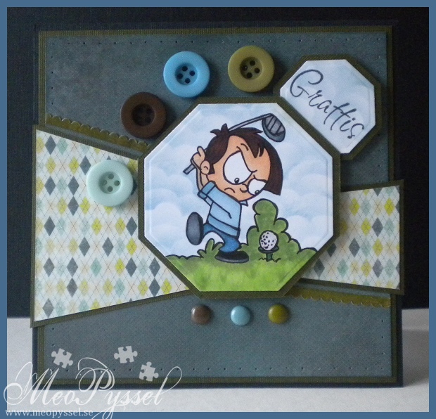
So I got an order for three cards, 2 golf cards and one blue house mouse card. So after a long days of crafting i have finished the two golfcards and the HM card only needs to have the image mounted.
This card is for my client’s husband on his birthday. So i choose my papers and embellishments from Basic Gray’s Marjolaine collection. The layout is from last weeks Sketch Saturday, but as usual when i start up a project midweek the challenges expired, but I’m really happy with the look. As you can see I once again tried to photograph after sunset so the photo is a bit blurry and the colors are a bit off. But the left side of the card is most true.

Sense I don’t have a golf-themed stamp i surfed the web a bit and found this cute little guy. He is from a coloring site, mainly for kids (you can find it here). I printed it on one on my Copic papers. Unfortunately the printer i used is a bit odd and refused to print it in black so i got an image in dark red so I traced all the lines with my black copic multiliner. At some parts you can still see hints of red but i hope the recipient won’t.

Copic: YG11, YG13, YG17, G29, G85, B91, B93, B95, B97, C10, C8, C6, 0, E00, E51, E21, E11, E57, E29, E49. Black multiliner.

Paper and embellishments are from Basic Gray’s Marjolaine collection.

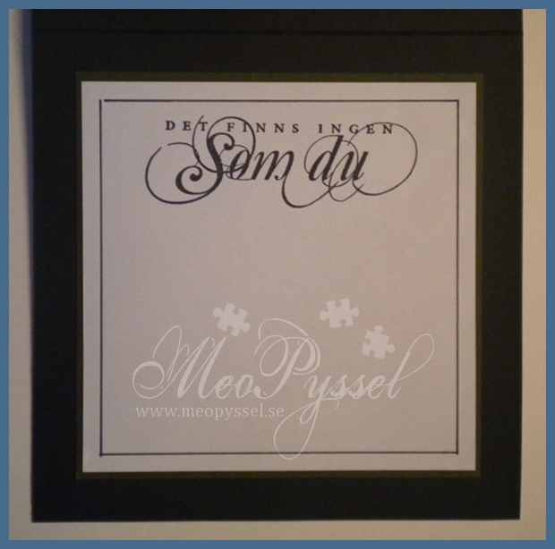
Stamps:”Grattis”-stamp is from reprints text-set. ”Det finns ingen som du” is from Arkivet.

Other: Spellbinders Octagon Nestabilities. Paper Piercer. Faded Jeans Distress Ink.

My Wedding-invitations

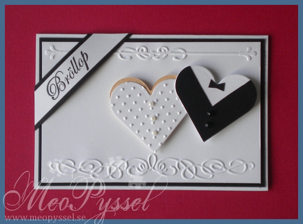
So i have finally finished wedding-invitations. I did finish them last weekend but it took me a while to package them and then get a photo.

The basic feeling, and layout is taken from Dawn from Stampin’ Up that made a very similar card. I kept the parts i could and changed some. You can see Dawn’s card here.

The embossed parts is from from two different small embossingfolders from Provocraft. The top one is from the Iron Works set and the bottom one is from the Organic flourish set. I also used the provocrafts Swiss dot embossingfolder for the ”weddingdress”.

The weddingdress is made by a skintoned heart and a white, embossed oneand finaly it’s decorated with three pearls, small or medium in white or pale blue. The jacket is made by a white heart and then a back on top, and the black ons has a triangle cut out from the top to make the jacket-shape. Finally it was decorated with 2 small or medium pearls and a small bowtie. On the picture you see a card with the small pearls.

The stamp is from You Do’s wedding set and it says ”wedding” in swedish

Dies and folders: Spellbinder’s Heart nestabilities, Provocraft’s Swiss dots, Iron Works and Organic Flourishes

Stamp: You Do’s Bröllop (Wedding)

A mermaid for my mother

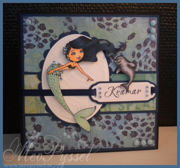
So this is a card that i made for my own pleasure on this long awaited weekend of no stress, school or other commitments.

I have wanted to make this card for a long time. The beautiful Treasure Tempestwind and her companion Eddy arrived in my mailbox for  probably a month ago or longer and i have wanted to play with her for a long time, she is from CC designs Sweet November collection. I knew i wanted to pair her up with the Barefoot Bliss papers from Bo Bunny due to its sea-theme. When i showed my mom the front paper, the one with the fishes she just loved it and when she is an aquarium-nut it’s just a perfect way to show how much i do appreciate her and her support.

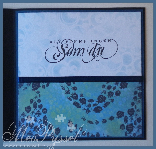
So… The papers that is used is from Bo Bunny’s Barefoot Bliss collection and i just love the bright shadow-fish that shows on the horizontal strip to the left. All the papers edges have been distressed with faded jeans. The backing for Treasure tempestwind and the tag is made by spellbinders nestabilities and I also used the circle impressabilities and embossed the white oval. I also used it in the inside as a stencil when i distressed some parts lightly with more faded jeans.

Both Treasure Tempestwind and Eddy have been colored with copics, and ’m just so happy with how Eddy and Treasure Tempestwind’s hair turned out!I stared out with B91, B93, B95 and B97 for the hair but wanted more contrast and darkness so i added some B18 and N7, N5- but still keeping the light parts in B97. I really like the black/blue feel of the hair and the shadowing, but i have to practice more on the lower part of the hair.

I watched Amy Young’s videos (find her youtube channel here) on marmaid-tail when i made this and really wanted to make a soft dotted one. Now as an afterthought i wish i would have made the shadows darker to create a better contrast, but that will have to be for next time.

The sentiment on the front is from Reprint and says ”Hugs” and the inside is from Arkivet (that sadly closed down this week) that says ”There is nobody like you”. Tempest and the sentiment have been decorated with light blue brads and light blue rhinestones. The ribbon is a usual satin ribbon from Panduro.

Copic: 0. Skin E11, E21, E51, E00, E93+R20, R22. Top and tail: Y17, Y08, N4, B97- YG11, YG13, BG13, B21, B41, B24, B97. Hair: B91, B93, B95, B97,  B18, N7, N5. Eddy: N7, N5, N3, N1, E93

Stamps: Sweet November’s Treasure Tempestwind and Eddy. Reprint’s text-set. Arkivet’s ”Det finns ingen som du”

Papers: Bo Bunny’s Barefoot Bliss

Dies: Spellbinder’s Classic Large Oval and Scalloped oval, Ribbon tags trio and Impressabilities Circles.

Glitery, Pink Florence


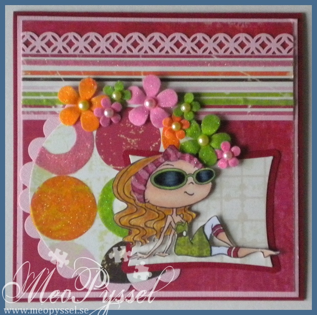
Here comes a card I’ve been working on the last couple of weeks. It’s an order for a friend of my moms and it’s for a birthday girl turning 10. The criteria was to use Kraftin’ Kimmie’s Florence and make it sparkle.

I started out doing this card for like two weeks ago and didn’t finish it until yesterday. Every time i go past my craft-corner i get drawn in by all my wedding inventions that needs some attention so it have been hard focusing on this card. I started out bu choosing this papers from Bo Bunny’s collection Vicki B, i love the vibrant colors and i think they would be super for a little girl. From that i colored and paper pieced her. So for a week ago or something i stared to think about the layout and fortunately for me Kraftin Kimme’s Challenge blog had a sketch up that i liked so i used it. Unfortunate for me when i entered the blog yesterday it seems a week have passed and a new challenge has begun. And happily for me it turned out that this weeks challenge is paper piecing so i can enter it anyway, whoho!

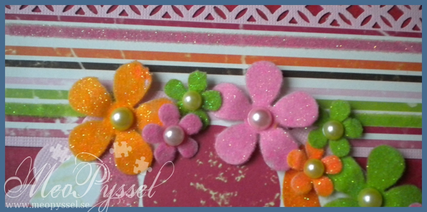
To add the glittery part of the card and to make some texture i used a lot of soft, glittery flocking from You Do. On the striped paper i made one green and one pink stripe flocked and on the paper with the circles i flocked all the circles that were pink, orange and green, to match the flocking i choose. I also added the pink flocking on the headband on Florence. As a last step i punched some flowers with EK Success’ Retro flower and flower power punch and flocked them in different colors. I thought the flocking was thick enough to cover what ever cardstock i used, but it wasn’t really true so i ended up remaking it with green, orange and pink cardstock to make a better coverage. I tried to take another photo of the flowers to show the nice shine and fussyness.

Stamp: Kraftin Kimmie’s Florence

Copics: YG13, YG17, Y17, Y21, R39, C0, C2, C6, C8, C10, 0, E21, E51, E11, E35

Papers: Bo Bunny’s collection

Dies and punches: Spellbinders Circle, scalloped circle and woky rectangles. Martha Stewart’s border punch Modern Garland. EK Success’s Retro Flower (medium) and Flower Power Punch.

Other: You Do’s flocking, Glossy Accent and some pearls.

Simon Says Stamp – Anything Goes
Kraftin Kimmies Stamps – #98 Paper Piecing

Pink Waterlilies

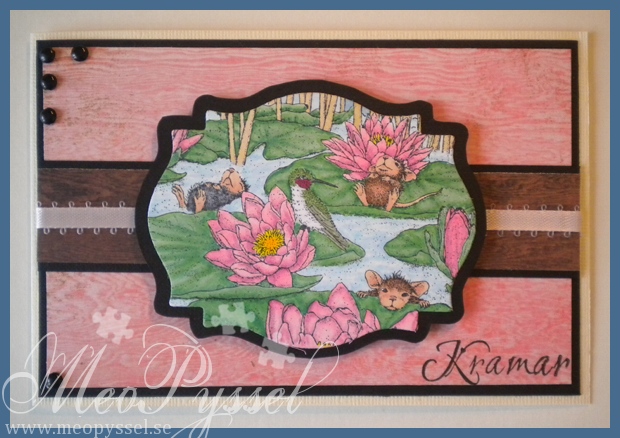
I have for a while now been coloring another House Mouse image for practice, and this time I used the lily Pad Pond from the Summer: Waterlily-set.

I’m really sick and can barely think straight so now when i decided i had to mount the image onto a card for this weeks House Mouse and friends challenge i really say that it turned out good, but it’s not terrible anyway.

So this will be a short one so i can get back to bed. Hope you enjoyed it anyway.

(the right side of this photo is most true to the real colors)

Copic:

  • Skin: E00, E21, E11, E13, 04
  • Hummingbird: N7, G85, YG17, C2, R39
  • Fur:R20, C8, C6, 4, E37, E35, E33
  • Waterlilies: Y08, Y17, RV34, RV23, RV21
  • water: B00, B21, 0
  • reed: E41, E43, Y21
  • sky: B41
  • greenery: G17, G14, G12

Paper: Basic Gray’s Life of the Party collection

Other: Nestabilities, brads and soft pink ribbon.

Twincards with Origins

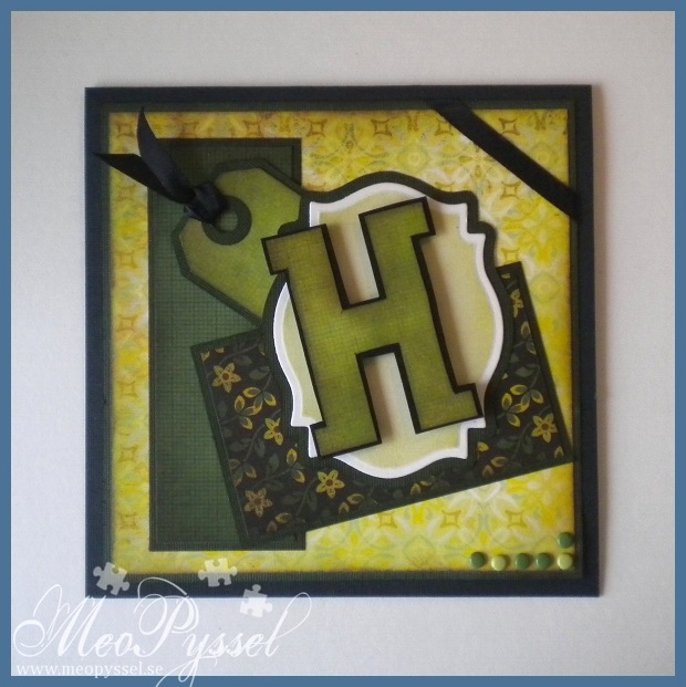
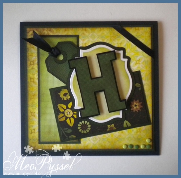
This weekend my twin cousins will get confirmed so i have made a card for them to go along with the gift. Sense they are twins I deiced to use the same layout and the same paper but switch among the patterned papers. I have troed to ge a more maskuline and rough clean stile if that makes sence.

Because it’s summer (and the fact that i got it home yesterday) i deiced to use Basic Greys collection Origins. I have used papers from the 6×6″ paperpack and some single 12″ papers. I have tried to have one brighter and one darker card.

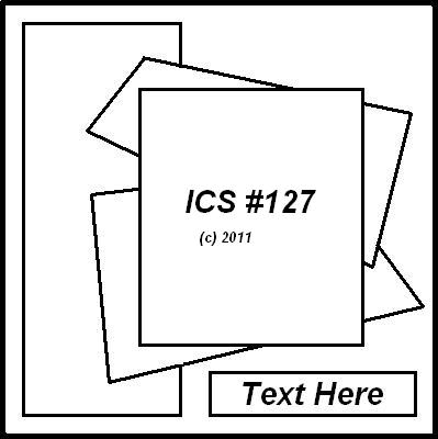
The layout is from this weeks Inspirational Card Sketches, a bit modified but i hope everyone can see the similarities anyway.

The H’s are for their names (Henrik and Harald) and I made them by drawing a template that i then traced four times. On the ones with the patterned paper i then cut away a small portion on all sides. The frame for the H is made with Spellbinders label 18. The tag is made with Tim Holtz’s die Tiny tabs and tags. The ribbon used for the tag and for the corner is a regular satin black ribbon. The dots in the lower corner is just some different colored brads.

All the papers and the frames have been distressed with distress inks. All the papers have been distressed with Peeled Paint and a little bit of Vintage Photo. The frames have been distressed with Shabby Shutters and a little bit of Peeled Paint.

The insides are also copies of each other and are only different by the paper that is used on the bottom. The chosen  paper is the same as the on the from so there is a connection between the two pages. You can see the insides here and here. I left a lot of white space so all the families signature will fit;).

Paper: Basic Grey’s collection Origins

Dies: Tim Holtz’s Tiny tabs and tags, Spellbinder’s label 18.

Other: Peeled Paint, Vintage Photo and Shabby Shutters Distress Inks.

Heavenly Breezy

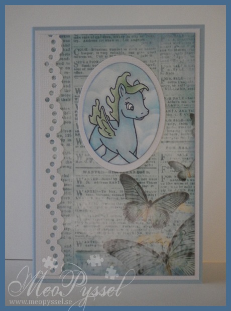
Copic: N1, N3, 0, G12, B00

Stamp: Sweet November’s Breezy

Paper: Inkido’s turquoise Newspaper

Dies: Nellie Snellen’s lacy Border, Spellbinder’s Oval (large and small)

Other: Faded Jeans and Tumbled glass distress ink

I got my Mojo back

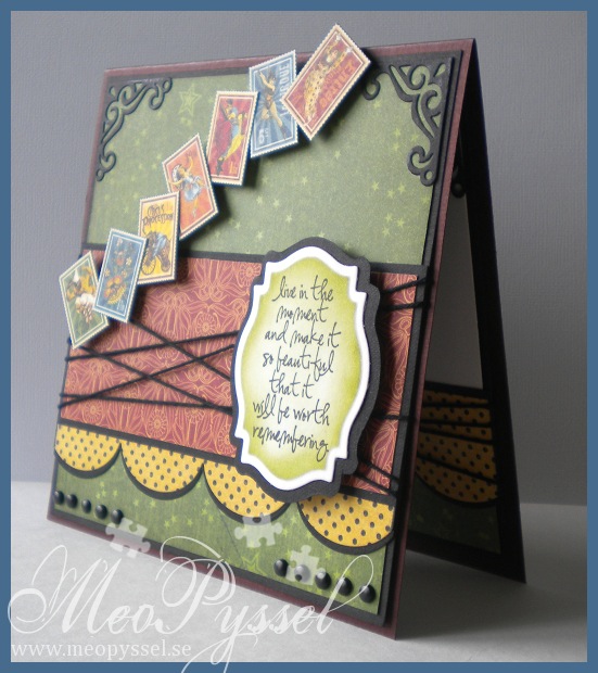
I think i have my mojo back! For the last couple of days i think that everything i do gets OK or worse but today I’m so happy with my card! I really think it’s a success and i really think it’s well balanced! I got my Mojo back, and with a MOJO sketch- how fun isn’t that? 🙂

This card is for my dear brother. His birthday was for a few month ago but we haven’t seen each other so i haven’t hurried with the card until now (we will meet this weekend). So a bit late, maybe, bu Happy brithday Oskar!

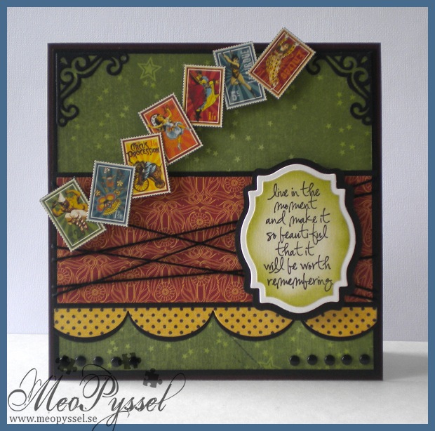
I did choose the colors by that fact that my dear brother told me he liked dark red and green and gray colors with a bit of old texture. I didn’t fin and burgundy or grays but i really like this green paper from Grapic45’s collection Le Cirque so i kept going from that one. All the papers i used if from the same collection. The stamps or circus-pictures that i used across the card is also from the same collection and i simple cut them out and put them up on foamdots.

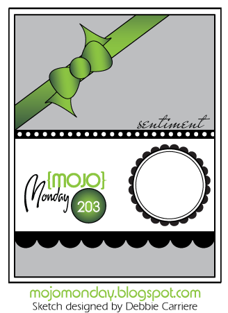
I did use this weeks MOJO Monday sketch for my layout. The focal-point is a Tim Holtz sentiment from the set Urban Chic. I actually started out with the sentiment, that i really is suitable for my brother when he really is out there living his life. I was after i had the sentiment i wanted the circus-stamps. I think it work very well together and i hope my brother will understand the connection and that I’m just amazed over his lifestyle. Anyway… i did frame the sentiment with my new favorite Nestabilitie, the label 18. I cut it out with one of the smaller dies and the traced around the outside of the die on a black paper to get a smaller frame to back it to then i would have got if I used the bigger die for the frame. That is one thing i dislike with the labels, that it’s a big difference between the dies but as long it can be traced around I’m not gonna be to noisy about it.

The green paper and the sentiment have been distressed with Peeled Paint and all the other papers have been with distressed with Antique Linen. The scalloped border is made by my new (and i think it will be an favorite) MFT’s Jumbo scalloped border. I did cut it twice, once in the dotted paper and once in the black so i could the a nice definition against the other papers. The other embellishments are the already mentioned stamps and some regular black brads and some black twine. I did embellish the corners with one of the corner-dies in the vintage die-set.  I so love the contrasts in the card, brought fourth by the black details.

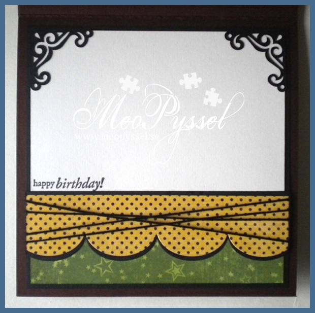
I tried to keep the same layout for the bottom of the inside with a feel smal changes, of course, to give space for the written greeting. The stamp that is used is from Penny Black’s clearstamp-set Critter Party.

Papers: Grapic 45’s collection Le Cirque

Stamp: Tim Holtz’s Urban Chic, Penny Black’s Critter Party

Dies: Spellbinder’s Label 18, MFT’s jumbo scallop border

Other: Peeled Paint and Antique Linen Distress Inks.

Mojo Monday – layout

A Spoon Full of Sugar – #162 Happy Birthday

Blue Magnolia Elephant

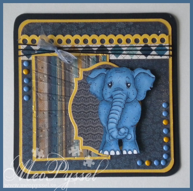
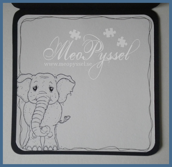
I have been trying to practice my copic-skills. I’m not a patient woman so i think it have gone so so but i like the results on this elephant. The shadowing is there but discrete but i like it, i think i succeeded on give it a bit of depth. I was a bit messy with the coloring so i needed to reinforce the white in the eyes and feet with a sakura pen.

The cute little elephants is from Magnolia and the Papers of the card is from MME collection Stella and Rose: Hattie. I did accidentally cut of the tail of the elephant while cutting it out and i left it off so that might vary from the original stamp. The yellow-ish cardstock that is used for the framing is gold-colored and has a nice shimmer to it. I used Tim Holts’s embossing folder Rays on on of the blocks and to make it appear a bit better i gently distressed it with Weathered Wood. The border on the top part is one of the two borders in Nellie Snellen’s Lacy Borders set.

The embellishments are simple the yellow and blue brads and the bow of almost transparent blue ribbon on the black thread. The ribbon is not tied hard so it can slide all the way across the card.

Papers: MME’s Stella and Rose:Hattie

Copic: B97, B95, B93

Dies: Nellie Snellen’s Lacy Borders, Spellbinder’s Label 18

Other: Tim Holtz’s Rays embossingfolder, Weathered Wood, Sakura White Pen

Toby’s teaparty on Echo Park

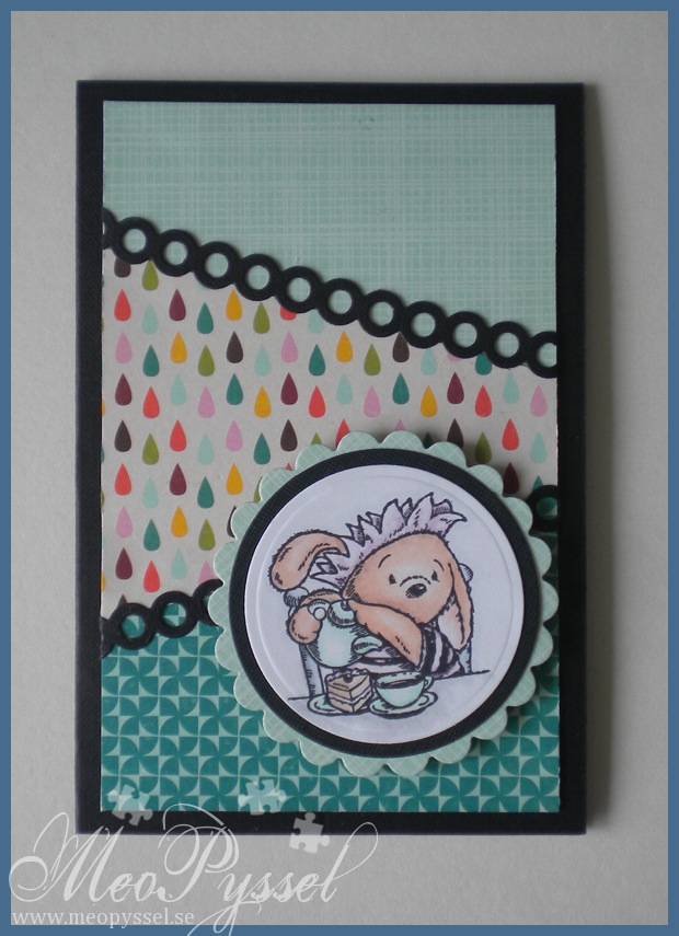
So i have finally finish this card off! The pieces have been laying on my desk for almost two week waiting for the border that will create the contrast.  I did the layout out of one of Amy Rysavy’s cards that i really liked, you can see it here. I love how she combined the colors and the image. I think that I succeeded with getting the colors from the paper into the image but hers i better balanced. The black border got a bit harsh but i really couldn’t find a better color in my stash.

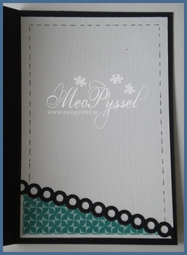
The papers is from Echo Park’s collection A walk in the Park and the die that is used for the borders are Dainty Dots from MFT. The framing around the image is made by nestabilities circles and scalloped circles.

The Image is a free sample from the paper The Craft Stamper. The image is a Cuddly Buddy and are a part of their image Toby’s TeaParty. I have colored him with copic and tried to keep it as bright as i could im am very pleased with the result:)

Papers: Echo Park’s A walk in the Park

Copic: 0, E13, E11, E00, N1, C0, C4, G00, V12, R20

Dies: Nestabiliet’s small and large circle and large scalloped circles. MFT’s Dainty Dots.