Etikett: Tim Holtz

Singing in the spring

2013-04-07

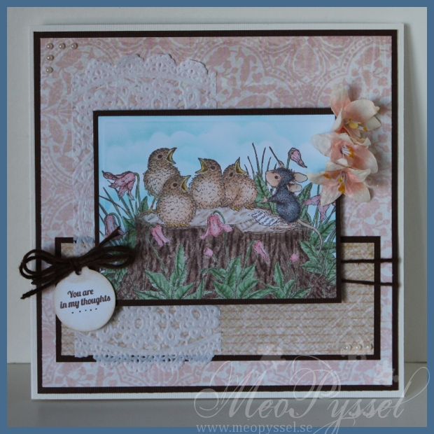
So here comes my card for this biweekly challenge over at the House Mouse and Friends Monday Challenge which is themed Spring. I chose this lovely image because it make my think of all the spring-feeling that is starting to bubbling up inside me.

The coloring is of coarse made with copics. The flowers was from the beginning colored to match another paper but i think it looks pretty good anyway. But i Just love how the birdies turned out, it just love the warmth and the depth that happened.

All the papers are from Bo Bunny’s collection Kitchen Spice. The brownish paper had the same pattern as the pink/peach one so I stamped two different background-stamps in desert stamp to get some more definition. The doilie looked better when it wasn’t glued down – it showed more.

I colored some white yarn with E59 to match the cardstock and used as a twine to hold my sentiment. The sentiment is from The Craft’s Meow’s collection Get well soon and the tag from Tim Holtz’s Tiny tabs and tags which I distress with some desert Ink. The dots that is added is just made with a brown pen.

material

Stamp: House Mouse – Feathered Friends – Sing your heart out. Hero Arts -Envelope Pattern. Gina K – Timeless Textures. The Craft’s Meow – Get well soon.

Paper: Bo Bunny – Kitchen Spice

Copic: E11, E21, E51, E50, R20, R000, G21, G24, Y21, Y26, E43, E41, E40, E49, E55, E53, E51, E50, N1, N3, N5, 0

Dies: Spellbinders – Nestabilities – Large Rectangle. Tim Holtz – Tiny tabs and tags.

Ink: Memento – Rich  Cocoa, Desert sand, Tumbled Glass.

Challenges

Träffar: 479

Sentiment as a focal point

Welcome to another week on Sweet Stampin’. This weeks challenge is “Use Sentiment as a focal point“.

I don’t own that many sentiments that are long enough or lyrical enough to use as a focal, in my liking. But I do own this one from Tim Holtz and I really like it and use it far to rarely. I wanted to play some with my new papers from Echo Park so I ended up with a masculine card.

I got the layout from last weeks Mojo Monday Sketch. I haven’t done a Mojo Sketch for a long time and I had forgot how much I enjoyed them. The red of the papers are bit bit more dull and rust-colored in real life.

The black banner is a bit raised due to the fact that i curled it up a bit with a pen. The stars dimensional. I first adhered the paper to a piece of black foam i had and then cut it out with MFT’s Stacking Stars. I just love how it turned out, I have to to this more often, I think I’ll try some letter next.I did doodle around the edge of the sentiment, it looked far to empty.

The inside is made with the same thought and material. The only exception is that the brads are different,I ran out off the smaller ones like on the front. I also forgot that dimensional stars might not have been the best idea for an inside but it closed good enough.

Stamp: Tim Holtz – Urban Chic

Paper: Echo Park -Note to self

Dies: Spellbinders – Nestabilities – Circle, Pinking Circle. My Favorite Things – Stacking Stars. Nellie Snellen – Lace Edge Border.


Träffar: 235

Theo’s 1th birthday

Have have to admit myself to be a bad godmother to little Theo. His birthday was this weekend and he still haven’t got a birthday-card. I started on but i have had a hard time getting back to everyday-life after the wedding and after-wedding-stuff. But i finally finished it so it will go in the mail in a second, better late then never I hope.

Anyway… I colored in one of my new stamps from the Greeting Farm’s set Just for You. I just love The Greeting Farm’s boys, not that to fond of the girls strangely enough. I colored him after the paper “Wish” from the Mind My Eye’s collection Fly a kite. I really like how the hat and shirt turned out, i like my latest buy of Copic more and more every day. The Paper is from My Mind’s Eye and the nice border is from the edge of one of the papers in the same collection. I have distressed the blue papers with Broken China and the green with peeled paint. The gray cardstock have been inked with memento’s tuxedo black.  I also doodled around the edges to get a more whimsy and fun look.

The greeting is handwritten by me and means “Congratulations”. The banner is made with my new die from MFT, the First award ribbon-die. I love the banner shape and just get annoyed when they don’t get straight so I bought the die – and it’s perfect! You will so see more banners from now on! The Number one is put on a tag from Tim Holtz’s Tiny Tabs and Tags, and i backed the tag with a gray paper that i cut with a nestabilitie circle.

Stamp: The Greeting Farm – Just for You

Paper: My Minds Eye – Fly a Kite – Wish, Out of the Blue – Boy

Copic: E11, E21, E51, E00, B91, B93, B95, B97, YG25, YG23, YG21, YG03, W5, W3, W1, E37, E35, E33, E31, Y08, Y15, Y14, E59, E57, E53

Dies: Spellbinders – Nestabilities – Lacy Ovals, Ovals, Circle. Tim Holtz – Tiny Tabs and Tags. My Favorite Things – Stacking Stars, By the number, First Place Award Ribbon.

Other: Distress Ink – Broken China, Peeled Paint. Memento – Tuxedo Black

Träffar: 95

Maskuline Party-mouse

 So yesterday i sat down to make a card for my friend’s birthday tomorrow. I wanted to use for of my Graphic45 papers when i think they work really good for a man so i choose some papers from the Le Cirque-collection.

The mouse is stamped on a tag created by using Tim Holtz’s Tiny Tabs and tags. I did color him with my copics and the paper-pieced the hat with the paper i used for the background. After tat i masked the mouse of and distressed the tag with Antique Linen, after that i stamped it with Hero Arts’ background stamp Envelope Pattern to get some texture. Unfortunate i made a bit of a stamping-mistake on the upper right corner so I did cover it with a Butterfly.

The layout is made by using this weeks Mojo Monday. The sentiment is from AmyR Sentiments and I made the banner by just cutting the edge and distressing it with more Antique Linen. First I stamped the Birthday with Memento’s Rich Cocoa, but it looked a bit to pale so i traced over it with a black pen.

Stamp: House Mouse – Birthday – Ice Cream. Hero Arts – Envelope Pattern

Copic: E13, E11, E51, E04, Y15, W5, W7, W9, 0, W3, W1

Paper: Graphic45 – Le Cirque

Other: Spellbinders – nestabilities – Labels 8. Tim Holtz – Alterations – Tiny Tabs & Tags. Butterfly-punches.

Ink: Memento – Tuxedo Ink and Rich Cocoa. Distress Ink – Antique Linen.

Träffar: 498

Labels for Beerbottles

So today we did some labels for one Björn’s beers. The label is just cut out in brown cardstock with Tim Holtz’s die Tiny tab and tags. I did use up all my scraps of brown, so they are in different shades of brown – but only the dark ones. The circles that is added is in another brown, or black, to get some contrast. The image is one that Björn found (online I think) that was a good one for this type of beer.

We decided to make the labels as hang-ons so we could re-use the labels for the next batch with same recipe. The twine that is used is a stiff one (bit hard to tie) but give of this nice rustic look.

Tim Hotlz – Tiny Tabs & tags.

Brown hard twine.

Träffar: 95

A floral Bubbels

So after a lot of christmas-cards i felt like making a card for my own pleasure and sense i really wanted to do a card with Sweet November’s Bubbles Lostlagoon.I just love her hair and she is the the only sitting figure i have so far so next time i will have to make something for her to sit on.

I first deiced that i wanted to use Bo Bunny’s Barefoot Bliss so I tried to color accordantly to the papers. I started our with the green tail and then kept going with the hair. I did want it to be a bit orange/yellow to match the hibiscus-flowers of the paper but i didn’t found a good combination due to the fact that i only have one orange so it got the be a bit more yellow. I don’t think it have enough contrast but that will have to be for the next time. The orange pen is an Copic original pen and i had a really hard time to blend it well when i used it direct to the paper, and i think it got a bit to soft when i used the tip to tip method with the Y17.

The frame for Bubbles is made with scalloped circles and circles nestabilities and the white oval have been embossed/letterpressed with the circles impressabilities. The tag is made with Tim Holtz’s Tiny Tab & tags and i backed the tag on a blue circle made with nestabilities circle. The stamp is from the text-set from Reprint (the swedish word for Thanks). The wave on the bottom is made with My Favorite Things Jumbo Scallop. The inside is made with the same wave.

Stamp: CC Designs Sweet November Bubbles Lostlagoon, Reprint’s Text-set

Copics: E11, E21, E51, E93, YG17, YG13, YG11, Y00, B24, B21, N3, BG49, BG02, YR09, Y17, Y08, 0

Papers: Bo Bunny’s Barefoot Bliss

Dies: Spellbinder’s Scalloped and normal Ovals, Tim Holtz’s Tiny Tabs & Tags, My favorite Things’ Jumbo Scalloped Die-namic

Träffar: 173

20 tags for Daiga

The other day my dear mother and her friend Daiga came by to talk about christmas-cards. Daiga is so far my biggest customer and she love House Mouse. After some coffee and a lot of house Mouse-stamping she deiced she wanted 20 christmas-tags, 15 small singled sided cards and 6 folded cards.

So yesterday i started up with the tags and I justed finished the tags. So here comes the result.

The tags is created by using Tim Holtz’s Tiny tabs & tags and the images is from House’s Clearstamp set Christmas. The images is colored using colored pencils and the edges have been distressed with Fired Brick or Pine Needles. On the image the red ones look a bit pink but they do look red in real life.

After looking at the photo i just realized that it’s only the image with the cheese that shows, but on half of the tags (apparently the lower half) I also used the mouse with the stocking.

Tim Holtz’s Tiny tabs & tags, House Mouse Clear stamp set Christmas and Distress Inks (fired brick and Pine needles).

Träffar: 132

Twincards with Origins

This weekend my twin cousins will get confirmed so i have made a card for them to go along with the gift. Sense they are twins I deiced to use the same layout and the same paper but switch among the patterned papers. I have troed to ge a more maskuline and rough clean stile if that makes sence.

Because it’s summer (and the fact that i got it home yesterday) i deiced to use Basic Greys collection Origins. I have used papers from the 6×6″ paperpack and some single 12″ papers. I have tried to have one brighter and one darker card.

The layout is from this weeks Inspirational Card Sketches, a bit modified but i hope everyone can see the similarities anyway.

The H’s are for their names (Henrik and Harald) and I made them by drawing a template that i then traced four times. On the ones with the patterned paper i then cut away a small portion on all sides. The frame for the H is made with Spellbinders label 18. The tag is made with Tim Holtz’s die Tiny tabs and tags. The ribbon used for the tag and for the corner is a regular satin black ribbon. The dots in the lower corner is just some different colored brads.

All the papers and the frames have been distressed with distress inks. All the papers have been distressed with Peeled Paint and a little bit of Vintage Photo. The frames have been distressed with Shabby Shutters and a little bit of Peeled Paint.

The insides are also copies of each other and are only different by the paper that is used on the bottom. The chosen  paper is the same as the on the from so there is a connection between the two pages. You can see the insides here and here. I left a lot of white space so all the families signature will fit;).

Paper: Basic Grey’s collection Origins

Dies: Tim Holtz’s Tiny tabs and tags, Spellbinder’s label 18.

Other: Peeled Paint, Vintage Photo and Shabby Shutters Distress Inks.

Träffar: 96

I got my Mojo back

I think i have my mojo back! For the last couple of days i think that everything i do gets OK or worse but today I’m so happy with my card! I really think it’s a success and i really think it’s well balanced! I got my Mojo back, and with a MOJO sketch- how fun isn’t that? 🙂

This card is for my dear brother. His birthday was for a few month ago but we haven’t seen each other so i haven’t hurried with the card until now (we will meet this weekend). So a bit late, maybe, bu Happy brithday Oskar!

I did choose the colors by that fact that my dear brother told me he liked dark red and green and gray colors with a bit of old texture. I didn’t fin and burgundy or grays but i really like this green paper from Grapic45’s collection Le Cirque so i kept going from that one. All the papers i used if from the same collection. The stamps or circus-pictures that i used across the card is also from the same collection and i simple cut them out and put them up on foamdots.

I did use this weeks MOJO Monday sketch for my layout. The focal-point is a Tim Holtz sentiment from the set Urban Chic. I actually started out with the sentiment, that i really is suitable for my brother when he really is out there living his life. I was after i had the sentiment i wanted the circus-stamps. I think it work very well together and i hope my brother will understand the connection and that I’m just amazed over his lifestyle. Anyway… i did frame the sentiment with my new favorite Nestabilitie, the label 18. I cut it out with one of the smaller dies and the traced around the outside of the die on a black paper to get a smaller frame to back it to then i would have got if I used the bigger die for the frame. That is one thing i dislike with the labels, that it’s a big difference between the dies but as long it can be traced around I’m not gonna be to noisy about it.

The green paper and the sentiment have been distressed with Peeled Paint and all the other papers have been with distressed with Antique Linen. The scalloped border is made by my new (and i think it will be an favorite) MFT’s Jumbo scalloped border. I did cut it twice, once in the dotted paper and once in the black so i could the a nice definition against the other papers. The other embellishments are the already mentioned stamps and some regular black brads and some black twine. I did embellish the corners with one of the corner-dies in the vintage die-set.  I so love the contrasts in the card, brought fourth by the black details.

I tried to keep the same layout for the bottom of the inside with a feel smal changes, of course, to give space for the written greeting. The stamp that is used is from Penny Black’s clearstamp-set Critter Party.

Papers: Grapic 45’s collection Le Cirque

Stamp: Tim Holtz’s Urban Chic, Penny Black’s Critter Party

Dies: Spellbinder’s Label 18, MFT’s jumbo scallop border

Other: Peeled Paint and Antique Linen Distress Inks.

Mojo Monday – layout

A Spoon Full of Sugar – #162 Happy Birthday

Träffar: 286

Blue Magnolia Elephant

I have been trying to practice my copic-skills. I’m not a patient woman so i think it have gone so so but i like the results on this elephant. The shadowing is there but discrete but i like it, i think i succeeded on give it a bit of depth. I was a bit messy with the coloring so i needed to reinforce the white in the eyes and feet with a sakura pen.

The cute little elephants is from Magnolia and the Papers of the card is from MME collection Stella and Rose: Hattie. I did accidentally cut of the tail of the elephant while cutting it out and i left it off so that might vary from the original stamp. The yellow-ish cardstock that is used for the framing is gold-colored and has a nice shimmer to it. I used Tim Holts’s embossing folder Rays on on of the blocks and to make it appear a bit better i gently distressed it with Weathered Wood. The border on the top part is one of the two borders in Nellie Snellen’s Lacy Borders set.

The embellishments are simple the yellow and blue brads and the bow of almost transparent blue ribbon on the black thread. The ribbon is not tied hard so it can slide all the way across the card.

Papers: MME’s Stella and Rose:Hattie

Copic: B97, B95, B93

Dies: Nellie Snellen’s Lacy Borders, Spellbinder’s Label 18

Other: Tim Holtz’s Rays embossingfolder, Weathered Wood, Sakura White Pen

Träffar: 103