Etikett: Graphic 45

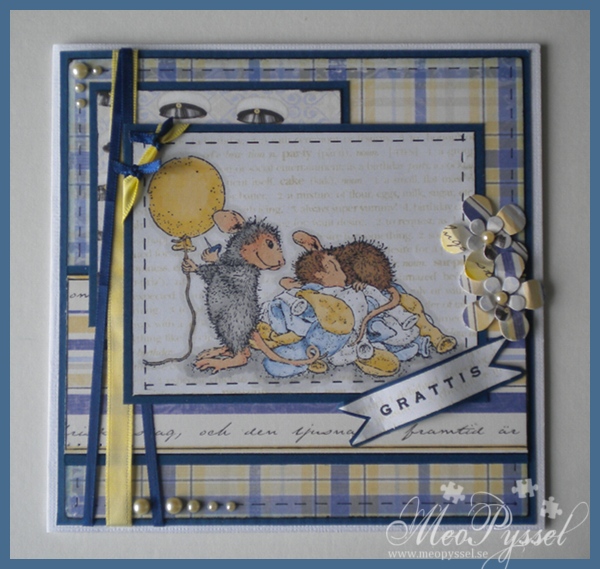
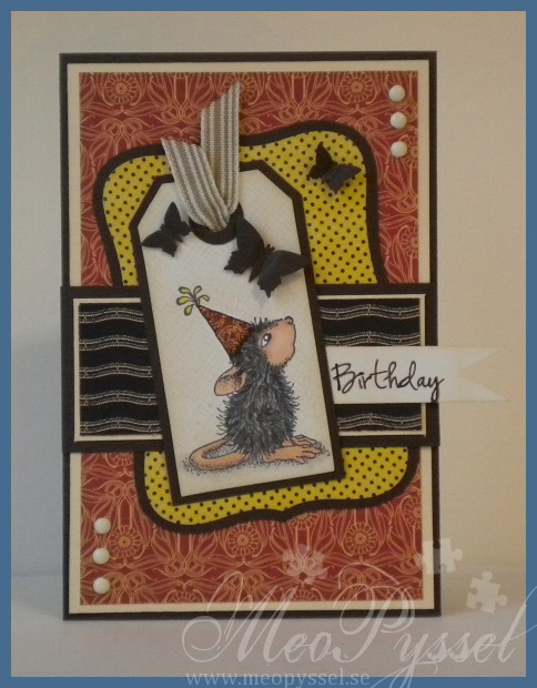
Maskuline Party-mouse

 So yesterday i sat down to make a card for my friend’s birthday tomorrow. I wanted to use for of my Graphic45 papers when i think they work really good for a man so i choose some papers from the Le Cirque-collection.

The mouse is stamped on a tag created by using Tim Holtz’s Tiny Tabs and tags. I did color him with my copics and the paper-pieced the hat with the paper i used for the background. After tat i masked the mouse of and distressed the tag with Antique Linen, after that i stamped it with Hero Arts’ background stamp Envelope Pattern to get some texture. Unfortunate i made a bit of a stamping-mistake on the upper right corner so I did cover it with a Butterfly.

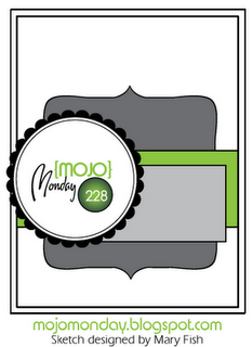
The layout is made by using this weeks Mojo Monday. The sentiment is from AmyR Sentiments and I made the banner by just cutting the edge and distressing it with more Antique Linen. First I stamped the Birthday with Memento’s Rich Cocoa, but it looked a bit to pale so i traced over it with a black pen.
Stamp: House Mouse – Birthday – Ice Cream. Hero Arts – Envelope Pattern

Copic: E13, E11, E51, E04, Y15, W5, W7, W9, 0, W3, W1

Paper: Graphic45 – Le Cirque

Other: Spellbinders – nestabilities – Labels 8. Tim Holtz – Alterations – Tiny Tabs & Tags. Butterfly-punches.

Ink: Memento – Tuxedo Ink and Rich Cocoa. Distress Ink – Antique Linen.

Träffar: 498

A New Year and top 7 from 2011

Happy New Year to everyone!

So I decided to make top 5 of my cards i made the last year. And i will try go get better ones during this year. This is also my way of playing around now when I’m away from home:)

So after looking at the cards made last year i realized that i couldn’t keep it to only 5 so i had to come do a top 7 instead. So here is my top 7 (in no specific order)

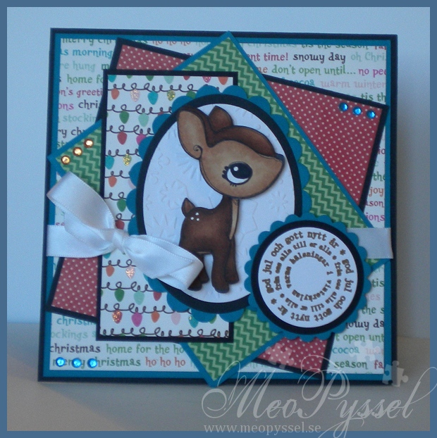
Holly Jolly Deer

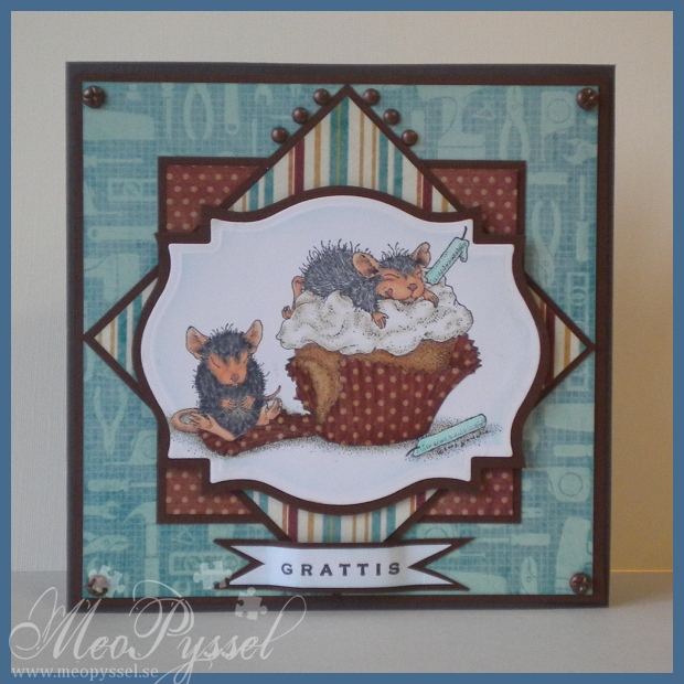
A Micely Cupcake for my grandfather

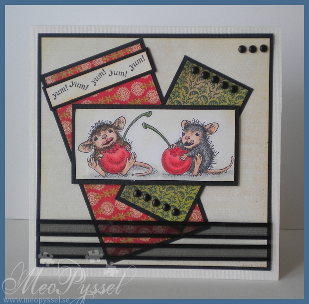
Fruity fun on Hello Luscious

I Got my Mojo back

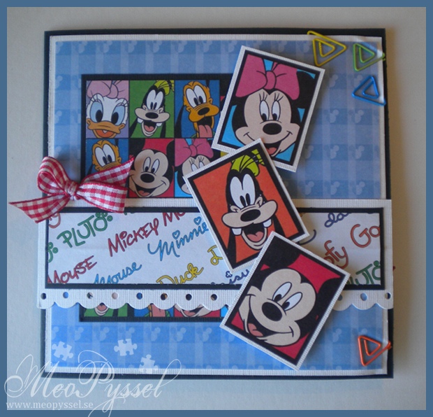
Disney’s Mickey and friends

Masuline Train

A House Mouse Graduation-card
Träffar: 90

I got my Mojo back

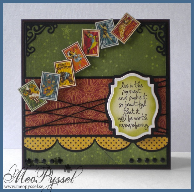
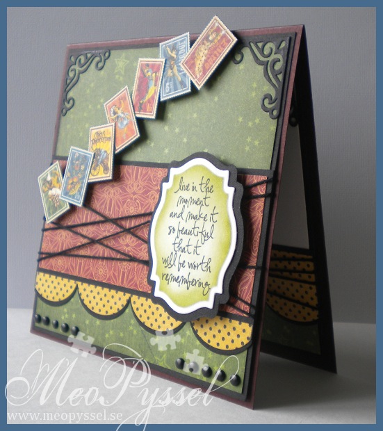
I think i have my mojo back! For the last couple of days i think that everything i do gets OK or worse but today I’m so happy with my card! I really think it’s a success and i really think it’s well balanced! I got my Mojo back, and with a MOJO sketch- how fun isn’t that? 🙂

This card is for my dear brother. His birthday was for a few month ago but we haven’t seen each other so i haven’t hurried with the card until now (we will meet this weekend). So a bit late, maybe, bu Happy brithday Oskar!

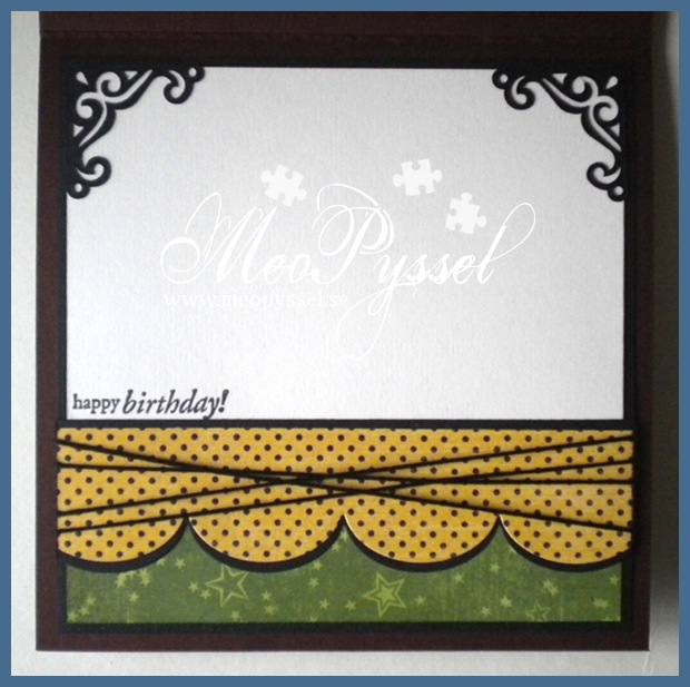
I did choose the colors by that fact that my dear brother told me he liked dark red and green and gray colors with a bit of old texture. I didn’t fin and burgundy or grays but i really like this green paper from Grapic45’s collection Le Cirque so i kept going from that one. All the papers i used if from the same collection. The stamps or circus-pictures that i used across the card is also from the same collection and i simple cut them out and put them up on foamdots.

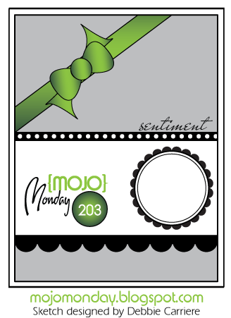
I did use this weeks MOJO Monday sketch for my layout. The focal-point is a Tim Holtz sentiment from the set Urban Chic. I actually started out with the sentiment, that i really is suitable for my brother when he really is out there living his life. I was after i had the sentiment i wanted the circus-stamps. I think it work very well together and i hope my brother will understand the connection and that I’m just amazed over his lifestyle. Anyway… i did frame the sentiment with my new favorite Nestabilitie, the label 18. I cut it out with one of the smaller dies and the traced around the outside of the die on a black paper to get a smaller frame to back it to then i would have got if I used the bigger die for the frame. That is one thing i dislike with the labels, that it’s a big difference between the dies but as long it can be traced around I’m not gonna be to noisy about it.

The green paper and the sentiment have been distressed with Peeled Paint and all the other papers have been with distressed with Antique Linen. The scalloped border is made by my new (and i think it will be an favorite) MFT’s Jumbo scalloped border. I did cut it twice, once in the dotted paper and once in the black so i could the a nice definition against the other papers. The other embellishments are the already mentioned stamps and some regular black brads and some black twine. I did embellish the corners with one of the corner-dies in the vintage die-set.  I so love the contrasts in the card, brought fourth by the black details.

I tried to keep the same layout for the bottom of the inside with a feel smal changes, of course, to give space for the written greeting. The stamp that is used is from Penny Black’s clearstamp-set Critter Party.

Papers: Grapic 45’s collection Le Cirque

Stamp: Tim Holtz’s Urban Chic, Penny Black’s Critter Party

Dies: Spellbinder’s Label 18, MFT’s jumbo scallop border

Other: Peeled Paint and Antique Linen Distress Inks.

Mojo Monday – layout

A Spoon Full of Sugar – #162 Happy Birthday

Träffar: 286

A cute Grapic45

I just wanted to do a very simple card suitable for almost all occasions so i came up with this.

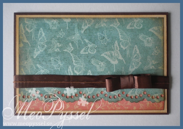
The Papers is from Once upon a Springtime collection from Grapic45. The borders is made by using a Nelli Snellen die, lacy borders. All edges have been inked with distress ink: Vintage Photo.

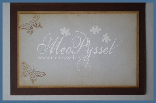
I didn’t use any Patterned paper on the inside but instead a stamped some butterflies, to keep on the butterflies from the patterned paper on the front. The butterflies is from a set from Royal Brush Clear Choice and is called Best Friends Stamp. The inside The inside have also been distressed with Vintage Photo.

Paper: Grapic45’s Once Upon a Springtime

Dies/Punches: Nellie Snellen’s Lacy dies

Ink: Distress Ink’s Vintage Photo

Träffar: 102

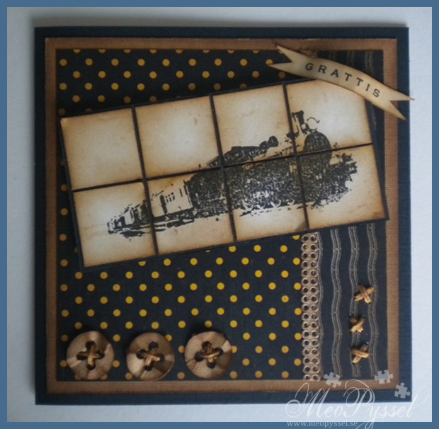
Masuline Train

Here comes another card for the men in our life, a dad.

The papers that is used is from Graphic45’s 8×8″ paperpack from the collection Le Cirque. Everything have been distressed with Vintage Photo. The Layout is this weeks Inspirational Card Sketches.

The image is Tina Design the train from the store Arkivet, here in town. The buttons at the bottom is from Provocraft’s Babyface Alphabet dies. The divider between the two patterned papers is a selfadhesive paper-lace from Panduro, also treated with Vintage Photo. I kept goinhg with the stitching from the buttons (embroidery-thread treated with Vintage Photo) on the other side if the card and on the inside.

Challenges entered:

Träffar: 285

Two necklaces

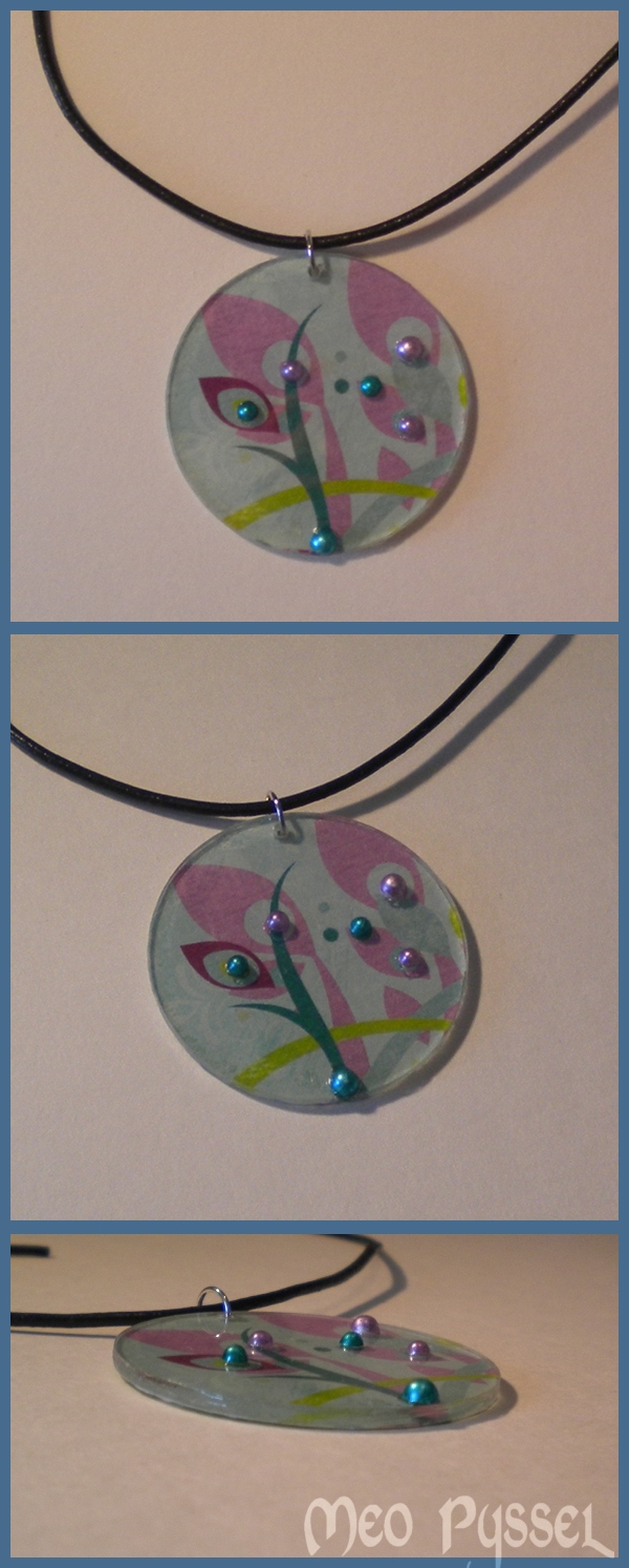
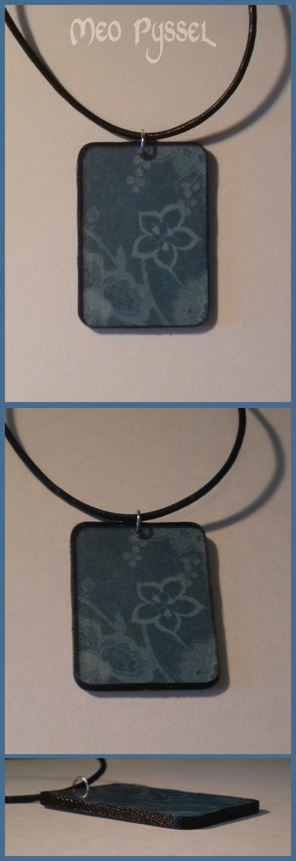
Today i have been making two necklaces. The base is a acrylic plastic, that i have bought from Panduro, and a silver jumpring.

The first one (the circle) is simple backed with paper, the Bo Bunny Peacock Lane from the Peacock Lane collection. I used Glossy accent as a glue and a seeler for the backside. Then i took a few pearls and colored then with my copics (V17 and BG49).

The second one is backed with Graphic45s paper Extravaganza from the Le Cirque collection. Then i took a thin ribbon and glued it to the sides so it got a more defined edge.

It did find it hard to make the glue perfect against the acrylic and i can see something behind it that ain’t that nice, not bubbles but some disturbance. But it’s only visible when you look very close so it won’t destroy the overall-visual of the pendant.

Träffar: 102

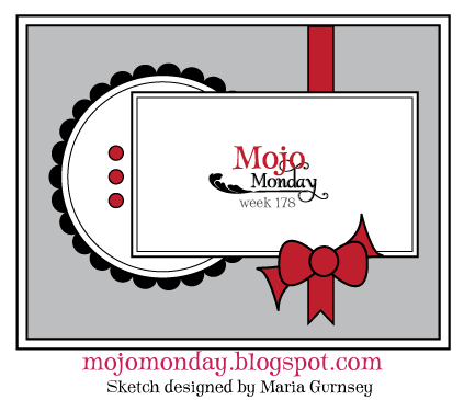
Mojo Monday challange 178: Steampunk Debutante

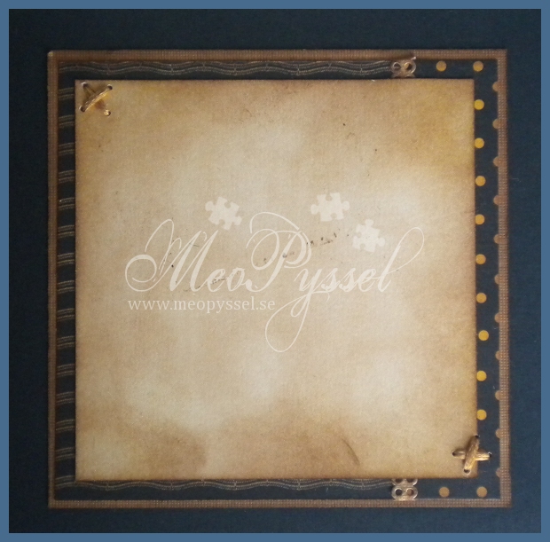
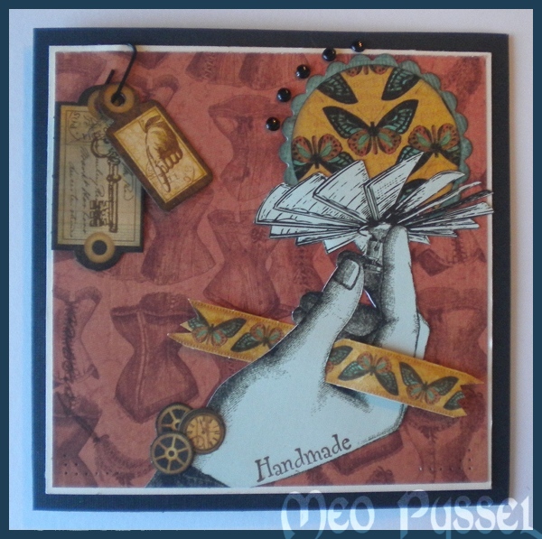
Idag har jag lekt med veckan Mojo Monday layout och mina nya papper från Graphic 45 och deras kollektion Steampunk debutante. Handen som jag använt är också från ett av dessa papper. Tag’arna i övre högra hörnet hänger i en ett vanligt svart metallgem och eftersom att de hänger löst rör de sig när kortet hanteras. Jag tycker att jag lyckats skapa ettcollage-kort och för att vara mitt första ett riktigt fint ett. Jag hoppas att andra håller med. Jag har stämplat texten Handmade och lifetime lite slumpmässigt och de stämplarna är av okända märken. Cirklarna är skapade med hjälp av nestabilities.Tagsen är från kollektionens die-cut papper.

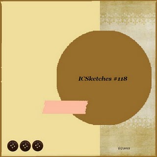
Bilden nedan är skissen som jag utgått från.

——————————————————————–

Today i have been playing with this weeks Mojo Monday Challange and my new papers from Graphic 45 the Stempunk debutante collection. It might be a bit hard to see the original layout that i have used but i do think that all the bits and pices are fitted in and created a nice collaged effect for this card. The two tags in the left corner are from the die-cut sheet and are simply hanged from a black paperclip and can move when the card is handled. The circles are created with the small classic circles and scalloped circles.

Träffar: 73

Första Easel-kortet

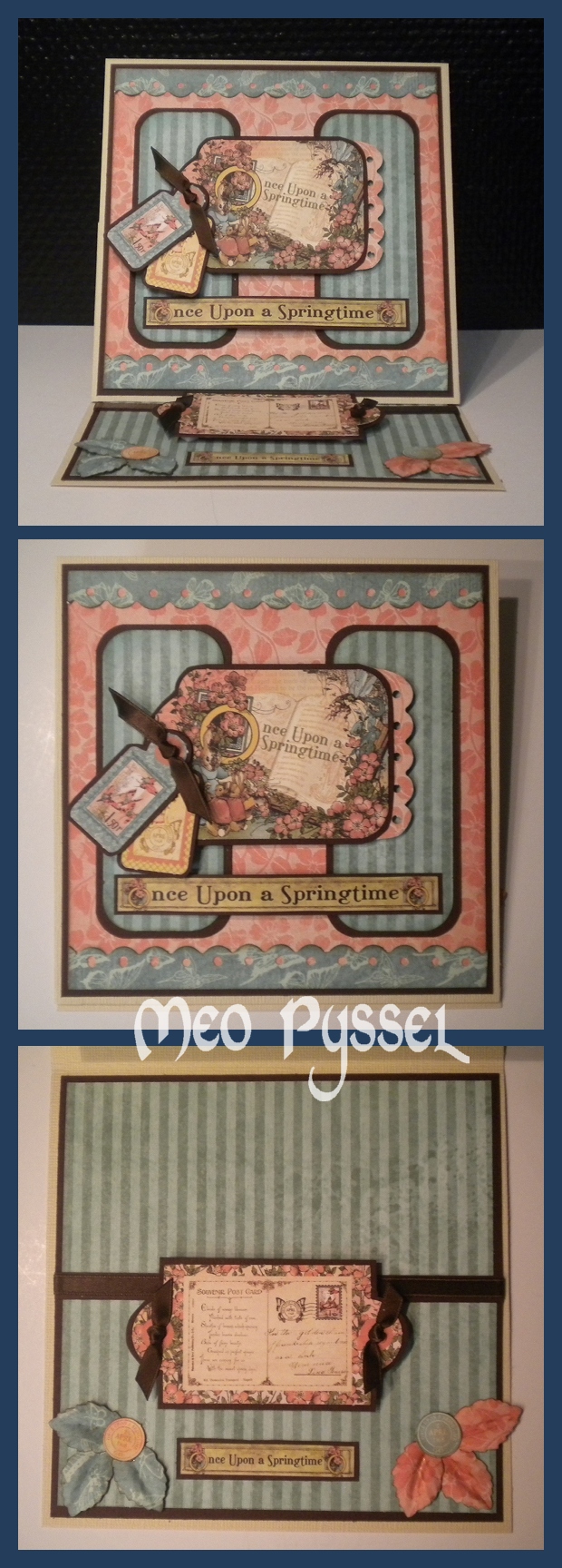
Jag tog mig lite tid och lekte mer med mina Graphic 45-papper och gjorde mitt första Easel-kort. Det var enkelt och kul. Jag gillar verkligen att man man ha budskapet på det här sättet. Mitt kort är baserat på ett kort med måtten 15x15cm. En lärdom är att kortet kunde ha stått upp enbart med hjälp av bandet och pappret under men jag ville ha dit en tag i alla fall.

Alla papper är Graphic 45 och kanten uppe och nere på framsidan är fiskars border punch. Löven på bottendelen är skapade med min nya Nelli Snellen stans.Alla kanter är distressade med vintage photo de rödaktiga papprena är även distressade med Tatterd Rose för att få mer djup. Det bruna bandet är ett vanligt sidenband. Hörnen är rundade med EK Success hörnstans, medium.

Träffar: 99

Kort med Graphic 45-papper

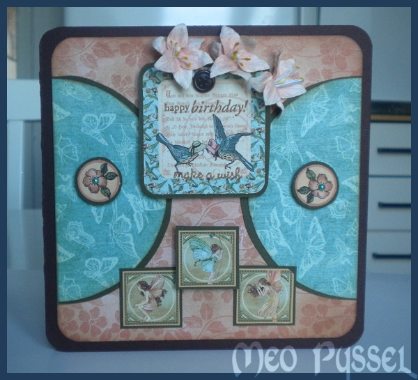
Idag har jag gjort ett kort med inspiration av Graphic 45-papper. Jag har använt papper från kollektionen Once Upon a Springtime. I mitt-tagen har jag stämplat med textstämplar från Penny Blacks stämpelset Critter Party. Jag har försökt att inte ha några vinkelräta kanter på kortet men ångrade mig mot slutet då det blev lite tråkigt, därför är de sista rutorna kvadratiska. Blommorna är från Magnolia. Mitten av de trycka blommorna är turkosa halvpärlor. Kortet är relativt enkelt då jag har en specifik mottagare för det men jag tror att just dessa papper skulle vara bättre med mer pynt så att säga, får se om jag orkar göra ett nytt kort imorgon.

De rödaktiga pappren är distressade med Tattered Rose och Vintage Photo. De blå korten är distressade med enbart Vintage Photo.

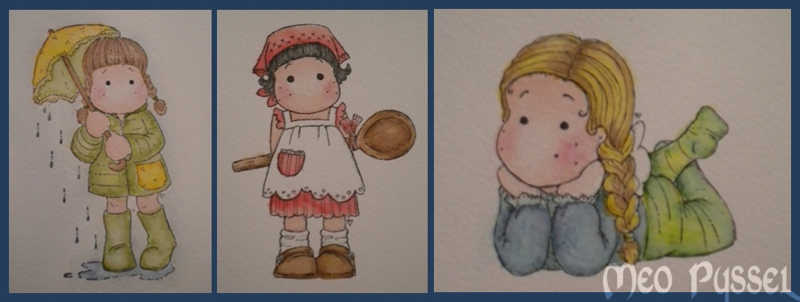
Jag lekt en del med distress-inks genom att åter igen testa att färglägga med dem. Jag tycker att det gick superbra mätt med alla tidigare gånger mätt. Jag får inte riktigt till det fortfarande men det är på gång. Jag är grymt nöjd med färgen på byxorna på Dreamy Tilda. Känns väldigt levande. Blev en del färg utanför men det beror på nog på att jag använde en stor pensel (använder den typen som har en fastsatt vattenbehållare).

Alla Tilda har Tattered Rose som ansiktsfärg och deras kinder är chalkade med torrchalks. På Tilda in Spring Rain har jag använt Shabby Shutters och Peeled Paint, Mustard Seed och Spiced Marmelade på jackan och paraplytet. Håret är målat med vintage photo och mustard seed. Kitchen Tilda har enbart Fired Brick på klänning och hätta, Vintage photo på slev och skor och Black Soot på håret. Dreamy Tilda har mustard seed och vintage photo i håret, tröjan är en blandning av Pine Needles och Faded jeans och byxorna är en blandning mellan Mustard Seed och Pine Needles.

Träffar: 75