Etikett: Magnolia

Here comes summer

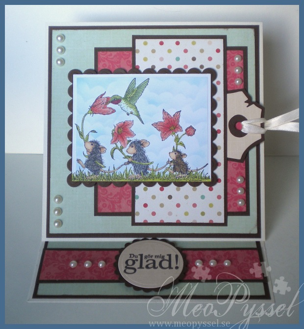
The other day I received some new House Mouse-sets. I of course wanted to play with them so after my exam this Friday I spent a lovely hour coloring in this sweet image. The card-making had to wait for on Saturday i was kidnapped for my bachelorette party, it was a blast!

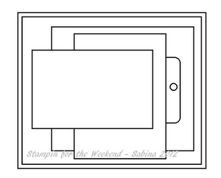
Well anyway I finally got some time to play around again so i finished the coloring and started this card. I have used this weeks Stampin’ for the weekend sketch. The tag is a die from Magnolia and I made a pocket behind the polka-dot-paper for it. As it is now there is no writing on it, I might ad something personal when I have a recipient in mind.
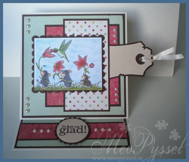
The mice is colored with copics and the clouds are made with one of my handmade templates and some Tumbled Glass distress Ink. All the edges of the paper have been inked with Memento rich cacao. The sentiment on the easel-stand is Swedish and says “You make me happy”.

Stamp: House Mouse – Feathered Friends – Sing your heart out. Arkivet – “Du gör mig glad”.

Paper: Echo Park – This and That – Graceful

Copic: R24, R22, R20, Y21, Y17, YG21, YG23, YG25, E13, E11, E51, R39, G85, G82, YG11, YG13, YG17, Y19, N1, N3, N5, N7, E53, E57, E59, W1, W3, W5, W7

Dies: Spellbinders – Nestabilities – Large Rectangle, Large Scalloped Rectangle, Scalloped Circle, Circle. Magnolia – Vintage Tag

Other: Distress Ink – Tumbled Glass

Träffar: 385

Soft Peachy Tilda

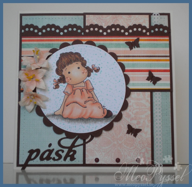
 Last week I decided to practice coloring fold, simple folds, and i choose this nice Sweetie Tilda from Magnolia to practice on. I have also for a long time been wanting to use my YR00-YR02 for this nice peach-color so I got on with it and this is the result. I’m really happy with the bottom-part of the dress and the hair but I should had made the belly-area a bit darker, but that will have to be for the next time.

After little Tilda’s dress was done I went looking for papers that would fit and I found this collection from Bo Bunny called Kitchen Spice. I think these papers are just beautiful with it soft and at the same time vibrant tones. I tried to match the hair and shoes to the paper and then making a dotted background (that I went a bit overboard with) to match.

As I’m not use to working with light colors like this I decided to try to use some flowers to get a easter/spring-feeling. And for being to things I’m not that comfortable with I’m very happy with how the card turned out. I have to admit that i just couldn’t chose a lighter cardstock, i still needed contrast but i still think it feels bright and light. I have no idea what brand the flowers are but i bought them in the Magnolia-shop in Borås like a year ago i think. I really like their color and shape.

The greeting “påsk” means Eater in Swedish and I intend this card to be an easter-greeting for one of my grandparents, I haven’t decided which ones yet. I’m not that into the whole Bunny-themed easter so this card is more of how i view eater, spring but still a bit chilly:). The letters i used is from Quickutz alphabet Harvest, which I love the look of. But i do hate the die (in my cuttlebug that is)… I never get it to cut everything so i always have to go over it with my knife. And i have tried like dozens of was to sandwich and fill out with cardstock but nothing works. If anyone has a tip I’d LOVE to hear it! I would like to use this die more often…

Stamp: Magnolia – Sweetie Tilda

Copic: YR02, YR01, YR00, YR000, E49, E29, E93, E11, E21, E51, E29, E39, E35, YR23

Paper: Bo Bunny – Kitchen Spice

Dies/punches: Spellbinders – Nestabilities – scalloped and normal circle. Nellie Snellen – Borders. Artemio – Butterfly 3 (small). Quickutz – Harvest Alphabet.

Other: Sakura – Gelly Roll – white

Träffar: 744

Theo’s Baptism-card


So my lovely godson Theo will get baptist this weekend and  he will be officially mine and Björn’s godson, so i made a card to go with his gift. We have bought cufflinks ingraved with “Theo” and I hope he will like them when he gets older.

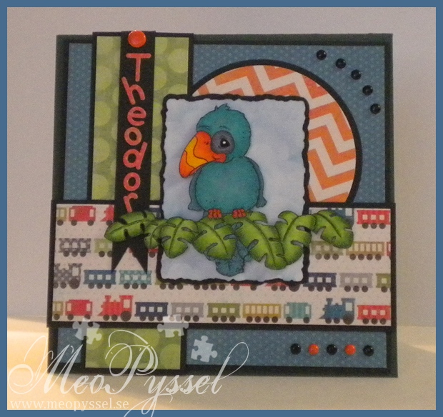
I sat a long time thinking about what stamp I could use for this card, I always think it so hard for a little guy. But i finally decided to use Magnolia’s Parrot and the Jungle leaves (from the pet collection). I had a bit of a problem to make the masking to get the parrot sit on the leaves. I had to first stamp the body of the Parrot and then masking it off. Then i stamped the leaves on top and masked then off also so i could stamp the feathers so they would peek out from underneath the leaves. The parrot and the leaves are of coarse colored with copics. I didn’t have any muted blue-greens so i used a lot of gray over so dull it out a bit.  The frame is Spellbinder’s deckled rectangles and i made the sky behind with a combination of Faded jeans and Broken china.

The Papers that i used are from My minds Eye Out of the blue collection and the Fly a Kite collection. And I just love the trains – they are the reason i bought them from the beginning. The letters for “Theodor” is Provocraft’s Baby Face alphabet. The black brads is some generic kind that i buy lots of and the orange ones, bot big and small, is from Paper Wishes Disney-set.

Stamps: Magnolia – Parrot and Jungle Leaves

Ink: Distress Ink – Faded Jeans

Copic: YR02, YR16, YR18, Y13, Y17, Y19, YG11, YG13, YG17, BG15, BG13, BG11, C4, C6, 0

Paper: My Minds eye – Fly a kite and Out of the Blue

Other: Spellbinder – nestabilities – deckled rectangles. Provocraft- Baby face

Träffar: 74

A White and very Blue Shaker “Star Tilda”

So i wanted to do my first shakercard for this blog. I did one long before the blog started but let’s just say that it was in the begining and every time i see it on my mothers shelf i wish she would take it down.

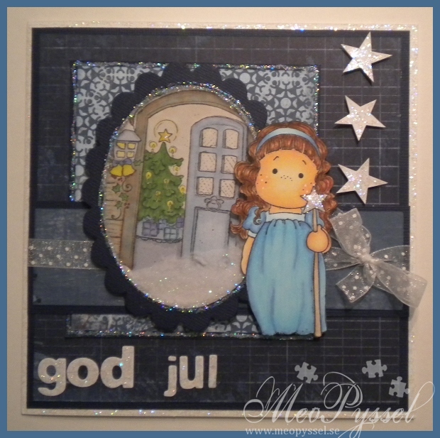
So i wanted to use one of my favorite stamps: Magnolia’s Star Tilda.I did color this one a while ago and i found Bo Bunny’s Midnight Frost to suit her well, so i kept going. And if you know me I’m crazy for blue so it got the be a very blue card with hints of white. On the scrapmeeting a while back i stamped some background that my friend Linda had so i deiced that one of them would be in the shaker. I colored it lightly with lots of gray and blender pen so it wouldn’t take to much of the focus away from Star Tilda. The shaker is is made by oval and scalloped oval nestabilities. The plastic is from an nestabilitiepackage and the filling is white flocking from You Do. As an after thought i think that card would have looked better white the scalloped edge white and the flocking should have been handled more, now when you hake the card the flocking has a tendency to clump a bit.

The stars and letters have been cut from a white (with small blue lines) paper from the collection. The letters are die cut with a Double Do alphabet and the stars i stamped with a stamp i had (on the backside of the paper) and the cut by hand. Both the letters and the stars have been covered with stardust stickles. The rest of the card and the star Tilda holds is also coated with stardust. The ribbon is a white dotted organza ribbon.

Stamp: Magnolia – Star Tilda an Welcome to a Sweet Christmas.

Copic: E31, E33. E35. E37, E39, B45, B21, B00, E00, E21, E51, E11, 0, E43, E41, C2, C4, Y19, Y15, Y21, R39, E40, E41, BV13, BV04, B91, B93, YG17, YG67, E31, E33, E35

Paper: Bo Bunny – Midnight Frost

Other: White Gelly Roll-pen, Stardust Stickles. Spellbinders – Nestabilities- Oval and Scalloped Oval. Double Do – Alphabet. You Do – white flocking

Träffar: 146

A Blue unwraped Tilda

So… On the 26th of November i was an a gathering in Kumla with my friend Linda. Sense then i have been sick and been on an education for a new job so i haven’t had time to do basically anything. On the gathering i started a Christmas card featuring Unwraped Tilda. I had such a blast but i only made it to completing the parts so the plan was to assemble it at home. Well i did assemble and complete it today- not really according to plan, hihi.

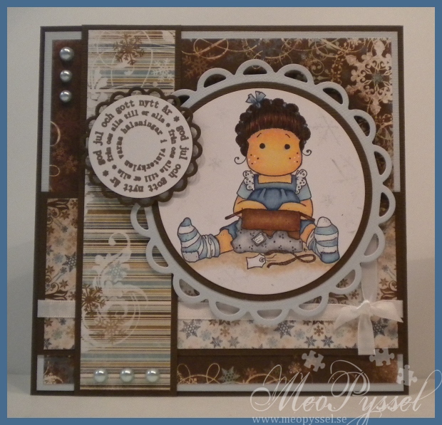
So i colored Tilda with copics as usually. I framed her with some circle nestabilities and lacy circles (that i borrowed from Linda and have fallen in love with!). I did some snowflakes in the new distress ink Iced Spurce, but it didn’t turn out very good but whats done is done. The papers that i used are from Bo Bunny’s collection Snowfall. The greetingis from Arkivet and are stamped in Aged Mahogany if i remember correctly. I did tie the ribbon around one of the papers as a gift so get a more christmasy feeling- i can’t remember who I saw it from first but i love the look of it.

Stamp: Magnolia – Unwraped Tilda, Arkivet – round God Jul

Copic: E11, E51, E21, E00, E93, E97, E95, E93, E91, BG11, C0, C2, E39, E37, E35, N5, N3, N1, E37, E39, E29, E59, E33, E31, E40, 0

Papers: Snowfall

Dies: Spellbinder – Large and small circles and lacy circles

Other: Distress Ink – Iced Spruce, Aged Mahogany

Träffar: 78

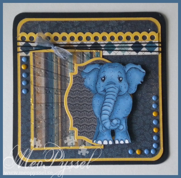
Blue Magnolia Elephant

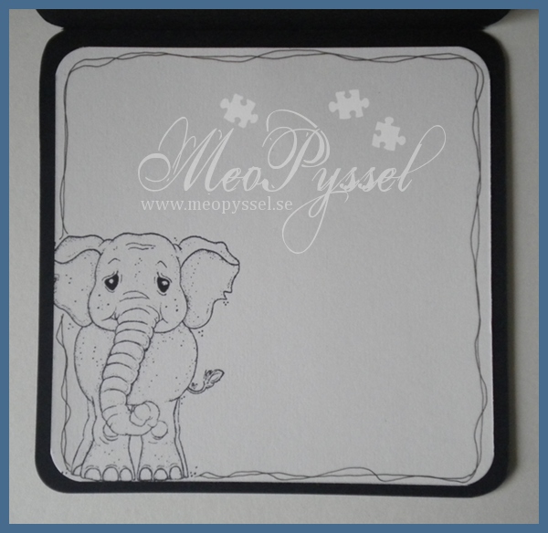
I have been trying to practice my copic-skills. I’m not a patient woman so i think it have gone so so but i like the results on this elephant. The shadowing is there but discrete but i like it, i think i succeeded on give it a bit of depth. I was a bit messy with the coloring so i needed to reinforce the white in the eyes and feet with a sakura pen.

The cute little elephants is from Magnolia and the Papers of the card is from MME collection Stella and Rose: Hattie. I did accidentally cut of the tail of the elephant while cutting it out and i left it off so that might vary from the original stamp. The yellow-ish cardstock that is used for the framing is gold-colored and has a nice shimmer to it. I used Tim Holts’s embossing folder Rays on on of the blocks and to make it appear a bit better i gently distressed it with Weathered Wood. The border on the top part is one of the two borders in Nellie Snellen’s Lacy Borders set.

The embellishments are simple the yellow and blue brads and the bow of almost transparent blue ribbon on the black thread. The ribbon is not tied hard so it can slide all the way across the card.

Papers: MME’s Stella and Rose:Hattie

Copic: B97, B95, B93

Dies: Nellie Snellen’s Lacy Borders, Spellbinder’s Label 18

Other: Tim Holtz’s Rays embossingfolder, Weathered Wood, Sakura White Pen

Träffar: 103

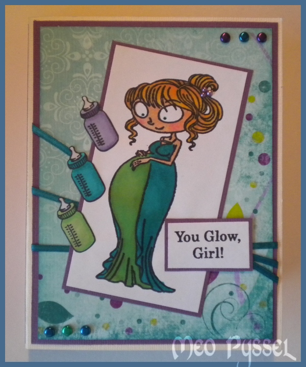
Caroline in a tealight card

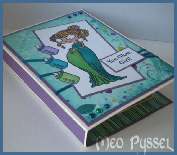
Todays card is one inspired by my pregnant friend, she is expecting her second and I’m really excited. This beautiful stamp landed in my mailbox today so I just had to make something with it. The stamp is Kraftin’ Kimmie’s Caroline. I have used both the main image and one of the texts and the bottle. All the images have been colored with a mix of promarkers and Copics (copics are used on the skin and as one of the three petrol-colors). I did also add some small pearls on her hairclip. The embellishments on the outside is metallic brads and a ribbon i found in my stash. All the papers is Bo Bunny’s Peacock Lane. All the papers have been distressed with either Peeled Paint or Broken China.

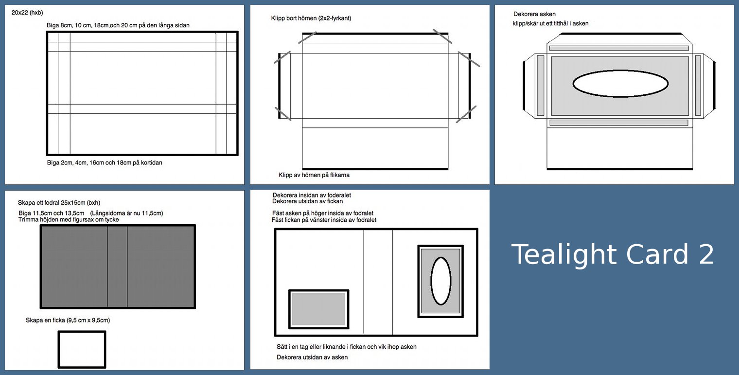
The card is a tealight card, another kind then the one i did the last time. I have made a template but in not happy with it, so i will try to make a better one on a later occasion so bare with me until that. You can find the template at the bottom (click to see it larger). I did another size on my pocket then the template shows because i felt i needed a bigger one. This kind of tealight card I first found the StampARTic site were there also is a very nice tutorial that my template is based on.

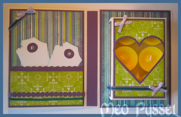
On the inside I used the same papers and ribbon but adding a light purple bow (made with my bow easy). The scalloped edge on the pocket is made with a scalloped scissor. The purple bubbles are a extra from Provocraft’s alphabet Babyface. The heart-window is made with a Nestabilitie, the frame of the heart is made by me tracing around the edge of the die so i just got a bigger thin frame. The tags in the pocket is Magnolia’s Vintage tag the i have distressed with some Broken China.

And by make a mistake i learned something so here is todays tip: Put the panel together first and glue it on the unmounted box, then cut the window and lastly assemble the box. I did the window and the box which made me make the window twice… Another goo thing to remember is that you don’t blue either the top or bottom flap when the box so the receiver can open it.

And here is a little picture of the card when closed. Something i don’t like with this kind of tealight card is that the tealightbox is so small that the edges probably will be bent in the mailing-process.

I’m really happy with the colors, but they are very me so it’s not strange. But i had another vision from the start which explains why i have the cream base for my card instead of something maybe petrol or green, but i think it looks good anyway. I’m also entering this card from this weeks Simon Says Challenge that is “Anything Goes”.

Träffar: 66

Basic Grey’s Challange 40

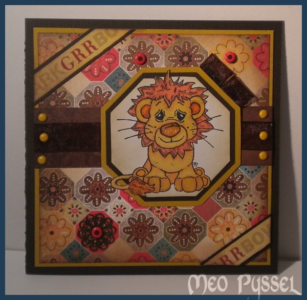
Todays card is made and inspired by the ongoing Basic Grey challenge. The theme of the challenge is recycled so i have recycled the ribbon used (it was from the beginning an embellishment on a skirt) and the pendant in the lower left corner (it’s an brokendown necklace). The Papers that is used are from Basic Greys collection Max and Wiskers. The words in the corners is a ribbon of unknown origin that i have distressed with Spiced Marmelade and then spritzed water on to make a more subtile color. The dots on the card, both yellow and orange, is brads of different brands. The image is Magnolias Lion and he is colored with Promakers (Mustard, Gold, Henna, Terracotta and apricot). The lions nose is coated with crackled accent but since i was a bit impatient i heated it with my heatgun and something happened that made it more like melted plastic then anything else. But my idea with it from the beginning was to create a texture like the nose of a cat and dog (and maybe lion?) i think it worked out OK anyway. The frame behind the lion is made with nestabilities. The inner frame is made by tracing on the inside of a die, the brown one is the same die but run through my cuttlebug and the last and yellow frame is the same die again this time traced round the outside.

I’m more and more often finding myself make a double frame on my card and i think that is a bit of waste of papers so i have started to cut out a square in the middle (in this card of the yellow backgroundpaper) and saving it for a later project. The first time i make this I thought that it might make the card unbalanced due to the layering in the middle of the card. But so far and with the bazilpapers that i most often use that isn’t a problem so i think that is a good tip for anyone that feels the need to save paper.

Träffar: 83

Andreas Magnolia

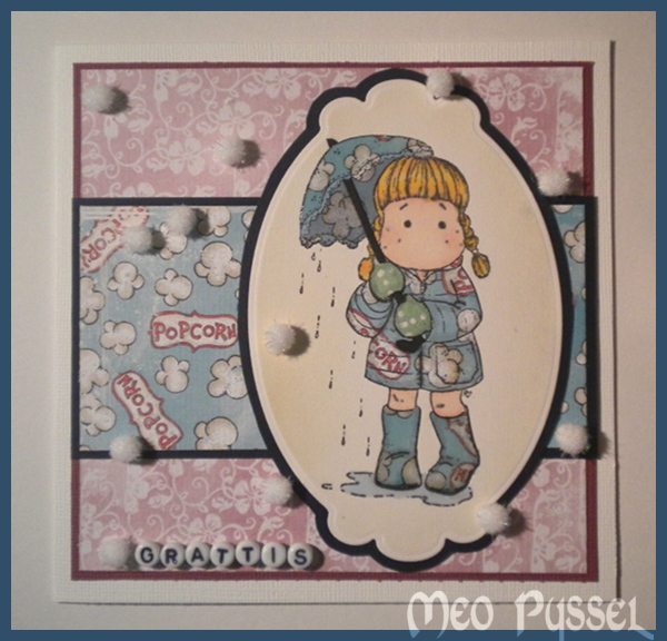
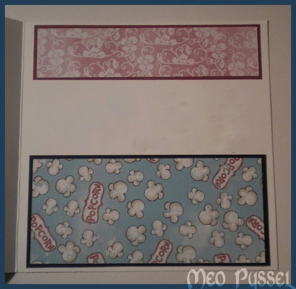
Nu har jag även gjort ett kort inför Andreas födelsedag nästa vecka. Jag har enbart använt Magnolias egna papper och motivet är Tilda in Spring Rain som är paper piecad med samma popcorn-papper som kortet har som bakgrund. Jag har med en ljusgrå promarker försökt att skapa lite skuggor. Gummistövlar och paraply är även täckt med glossy Accent och fickan är täckt med crackle accent för att skapa en liten kontrast. Bollarna som är strödda lite överallt skall föreställa både popcorn och snö. Runt Tilda har jag distressat med Antique Linnen. Hälsningen Grattis är gjort med hjälp av bokstavspärlor från Panduro. Jag gillar verkligen hur jackan ser ut med popcorn-pappret, jag tror jag måste paper pieca lite mer. På insidan har jag fortsatt med samma papper och lämnat ett lite utrymme för en hälsning. Jag har försökt att censurera bort min hälsning och det är därför som färgerna ser lite konstiga ut i mittdelen.

The second card of today is for my small friends birthday next week. I have used Magnolia papers and the stamp Tilda in Spring rain. I have been  paper piecing the cloth of Tilda and I also tried doing shadown with a grey promarker. The wellis and the umbrella is covered with glossy accent and the pocket is covered with crackle accent to both bind and make diffrence between the diffrent clothpieces. The cottonballs alla over the card is trying to symbolize both popcorn and snow. The Image shape is nestabilities and it have been distressed with Antique Linnen. The sentiment is letter beads from Panduro. On the insida i have keept going with the same papers and just tried to frame the greeting. I have censured out mu greeting and that why the colors in the middlepart looks a bit off.

Träffar: 68

BoBunny och Cinder

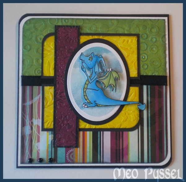
För några dagar sen fick jag hem lite stämplar från Sweet November Stamps. Jag fick hem Cinder, Meadow och Breezy. Jag gillade hästarna för att dom var allmänt söta men lilla Cinder är jag helt kär i!

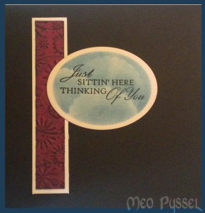
Jag har ägnat mig att göra lite olika färgläggningar och jag valde den fina blå-gröna till ett kort. Tyvärr blev svansen lite illa behandlad i röran på mitt skrivbord men den gick i alla fall inte av. Alla papper som är använda är BoBunny av lite olika kollektioner. Jag blir bara mer och mer förtjust i BoBunny papprena. Jag funderar på att köpa in paperpacks i några kollektioner. Nästan alla papper är även körda genom lika Cuttlebug embossingfolders och samtliga papper är distressade med Broken China och Black Soot. Det är lite svårt att se på bilden men det blev ev riktigt läcker effekt när man kan se papprets mönster och embossingmönstret samtidigt (idén och faktiskt layouten fick jag på Paper in the Works). Längst ner i hörnet på kortet är det tre glansiga svarta brads. Ovalen bakom Cinder är distressad med Broken China och Faded Jeans och en scalloped circle för att efterlikna moln och samma sak gäller insidan som syns på bilden här under. Stämpel på insidan är från Magnolia. Jag har använt Ek Success cornerstans för de rundade hörnen.

Träffar: 259