Kategori: Papperspyssel

House Mouse Birthday-Spring-Card

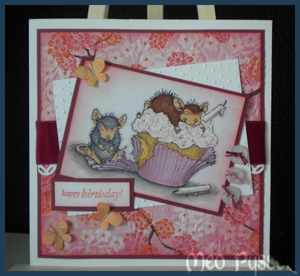
Todays card is a birthday card for my sister that turns 23 in the beginning of next week.. I don’t think this is the colors i associate with her but i stared with a pink cupcake-holder then i just became this pink…

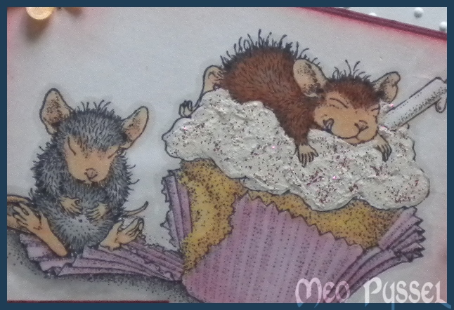
The image is House Mouse Birthday Cupcake that is a part of the Birthday: Ice Cream-set. The little mouse with the cheese-gift, on the inside of the card, is from the same stamp-set. The images is colored with promarkers and i’m really happy with the result on the cupcake (gold, apricot and pastel yellow). On the frosting on the cupcake i have used my snowmarker, very thin layer, and then i painted on some Magenta sticklers. I use a brush to paint the stickles so i could get a thin layer and exactly were I wanted it. You can see the dimension and the frosting better in the picture to the right. The sentiment is a Penny Black stamp from the Critter Party-set. I stamped it with Versa Colors 15 Magenta. 184 Misty Mauve and 13 Orange to match the colors on the paper that is from Crate Papers collection Pink Plum. I have tried to keep the color-scheme on the inside.
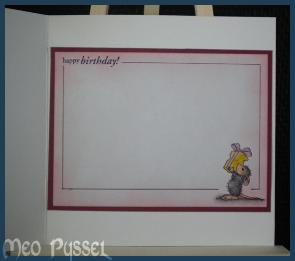
All papers and stamped areas have been distressed with Worn Lipstick and the fabric butterflies have also been distressed with Worn Lipstick and some Spiced Marmelade. The butterflies had a to strong colors so i used the backside up to just get a hint of the original color that i then altered with distress inks. I just stapled on the butterflies with a regular staple-machine. The background paper and the white paper have been dry embossed with provocrafts embossingfolders. On the background i used Victorian and on the white paper i used swiss dots. The border under the ribbon is made by Martha Stewart’s border punch modern garland. The buttons is from old clothing and have been embellished with some multicolored pink thread.

The Layout form this card i got from this weeks Sweet Stop Challenge (SSS104). And due to nice circumstances I’m also entering this card for a couple of more challenges.

Challenges:


And THANK YOU Kristina for borrowing me the Easel. I think it works great and made the photographing much easier. Now i need to but my own and paint it!
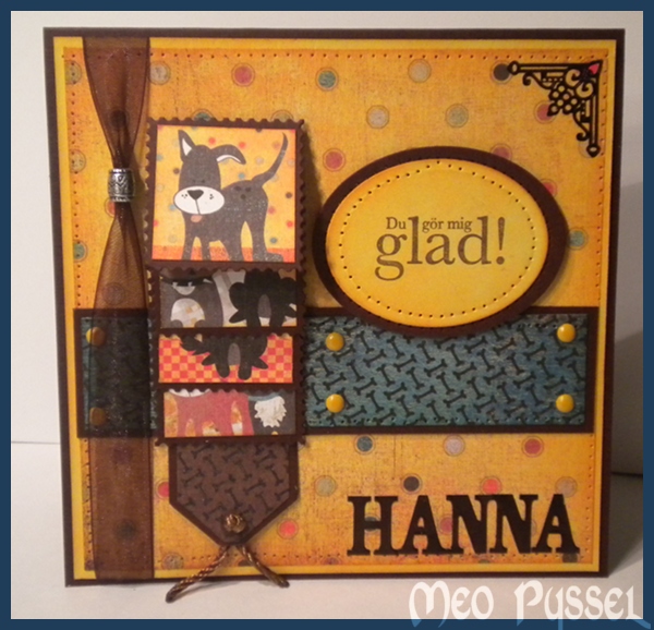
Basic Grey Waterfall card

This card is made for this fortnights Basic Greys challenge ”More the one fold”.

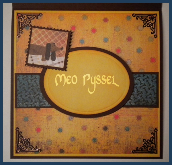
All the papers are Basic Greys Max and Whiskers and the images are cut from a sheet from the same collection. I have for a long time been thinking of making a card with a waterfall feature, but not like the normal ones with the waterfall in the middle and that it. So instead i made it as a side-treatment on a regular square cardbase. I do like the look f it but it’s a bit to much of the main feature right now, i will have to keep experimenting. The frames for the images is a Povocraft die, a free sample I got when o bought my cuttlebug, in shape of a stamp.

The Greeting shape is a nestabilities and the corner treatment and the letters (at the bottom front) is Peel-off and stickers that i have colored with a black permanent marker. Even if the marker is black i have found out that all surfaces that is a bit glossy will turn out dark brown. All light papers have been distressed with Spiced Marmelade and the blue paper with Broken China. The Greeting is stamped with Versa Colors 171 Pine Cone.

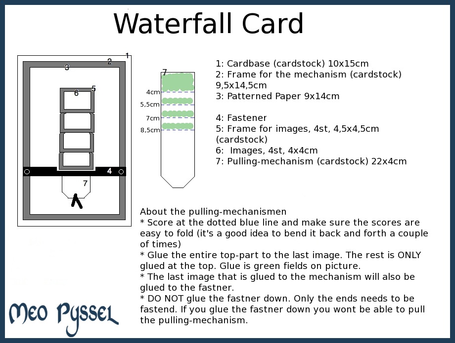
For those that want a waterfall-template i have one (click for a larger image). You can switch all the measurements but keep the pulling-mechanism a bit thinner then the frames. Parts 4-7 is the waterfall-mechanism and can be put on all different kinds of card.

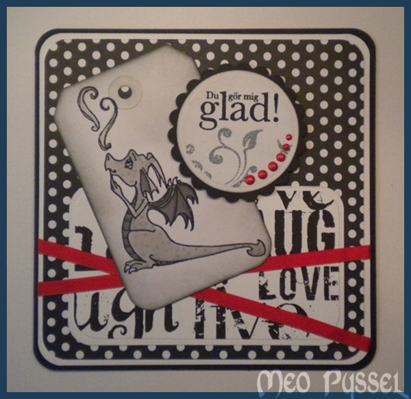
Black and White: Cinder

This evening i have made a black and white card with a bit of a flare. The image is Sweet Novembers stamp Cinder. I stamped Cinder on a big white tag that i then trimmed off to the right size. The tag have been distressed with both weathered Wood and Black soot. Cinder himself (or her?) is colored with the cool Grey promarkers.  All the patterned papers are from Canvas Crop, a for me unknown brand but i fell for a couple of their black and white patterns. The sentiments shape is created by nestabilities and i stamped the sentiment ”du gör mig glad” (”You make me happy”) with Memento and the swirls with weathered Wood. The entire shape is distressed with weathered wood and black soot and have been embellished with some drops of red pearlmaker. To bring some color in i deiced to add some red with the pearlmaker and the red ribbon. To make the card a bit softer i used a corner punch (EK sucess, medium) and cut all corners i could find.

——————————————

Kvällen kort är gjort med min käre sambo i åtanke. Efter 3 år vet jag fortfrande inte vilken färg eller nyans som han gillar förutom svartvitt så det blev svartvitt med en hint av röd kärlek. Bilden är Sweet Novembers Cinder och jag har målat honom med promarkers cool grey-serie. Jag stämplade honom på en tag som jag sedan skar ner till rätt storlek och distressade med weathered wood och Black soot. Samma behandling har textcirkeln fått och i den har jag även stämlat texten med svart Memento och rankan med weathered wood. De röda prickarna är röd pearlmaker som jag sedan försökt att matcha i bandet som är fäst över kortet. Alla papper kommer från Canvas Corp, är för mig okänt företag men jag gillar deras svartvita mönster.

Jag har länge velat göra ett kort med tag, jag föreställde mig det inte på det här sättet men det är en bra början tycker jag.

Basic Grey and House Mouse birthday

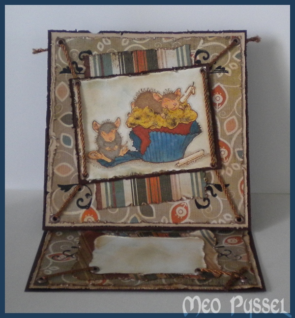
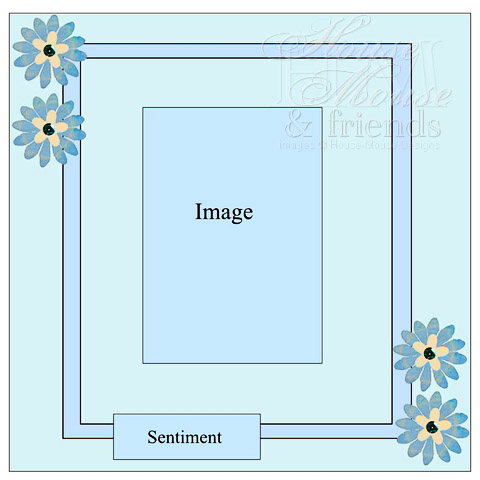
This card is made for my friend Kristoffer and his birthday this weekend. The inspirations for the card I got from Basic Greys Challenge and House Mouse Challenge for this week. The Layout is from the House Mouse one and the Basic Grey challenge is ”more then one fold” so i decided to make an Easel-Card. All the papers are Basic Greys Pyrus and the stamp is from House Mouse set Birthday: Ice Cream and the stamp Birthday Cupcake. The image is colored with both Promarkers and Copic and the frosting is coated with some glossy accent that have been sprinkled with a bit off black embossingpowder. I tried to find something good as sprinkles but couldn’t find anything suitable and embossingpowder was the best i could come up with (too late I realized that i could have used some of my brown flocking, but maybe next time). I embellished the card by putting in eyelets in the corners of the cardfront and the image and threaded a rounded ribbon through them. Due to the fact that this cardfront is mounted on an Easel-card i just taped down the ends in the bottom half and I did a knot with a piece sticking out on the top half were you can see the backside of the card. I keep  going with the ribbons on bottom part of the card but on the right side i did a visible knot. All the papers are roughed and distressed with vintage Photo. The Image is also distressed with vintage photo and i added some faded jeans. The black embellishments are rubb-ons that i cut into small pieces.

——————————————————-

Dagens kort är inspirerat av veckans House Mouse och Basic Greys utmaningar. Basic Grey vill se olika typer av vikningar och House Mouse har en layout (se höger). Stämpeln är som används är Birthday Cupcake från House Mouse set Birthday: Ice Cream. Jag har färglagdt med promarkers och Copics och frostingen är täckt med Glossy Accent och lite svart embossingpulver. För dekoration på kortet har jag valt att fästa eylets och dra igenom ett brunt, runt band. På den övre halvan av kortfronten har jag gjort knutar som syns och på den undre sidan har jag bara tejpat fast bandet då det döljs av Easel konstruktionen.


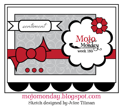
Bright Springcard (Mojo185)

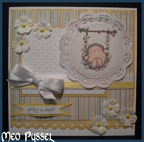
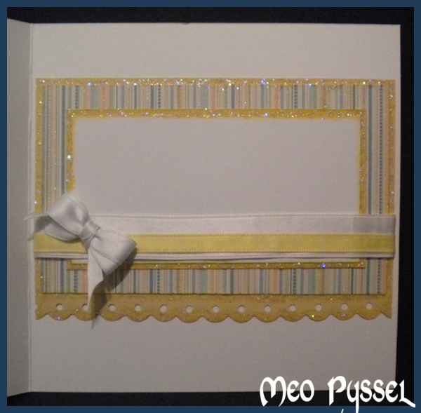
Today i have been working with this weeks Mojo Monday (#185) and my Penny Black stamps that i have realized i don’t use as much i would like. The striped paper is from DCVW’s paperpack Baby Boy and the white paper is regular cardstock that is embossed with Provocrafts Swiss dots. The image is from Penny Black clearstamp-set Garden friends and it’s colored with promarker and copics and the cheeks are chalked. The sentiment is from the same stamp-set and have been stamped with Shabby Shutters. The bow is double-looped and made with my Bow-easy. The border is made with Fiskars scalloped border-punch. The image is cut with a nestabilities and a doyle. The flowers are from Reprint and are centered with a brad (there are two different yellow ones). The  card is covered (edged, flowers and image and sentiment) with stardust stickles to match the glitter in the striped paper. You can se the layout and the inside at the bottom at this post.

Dagens kort är ett vårkort med mjuka och ljus färger för att kompensera den grå himlen utanför. Layouten kommer från veckans Mojo Monday (nr185). Motivet  och texteb är från Penny Blacks set Garden friends och jag har faktiskt användt både promarker och copics. Cirklarna är nestabilities och en doyle. Den vita rektangeln är torrebmossad med Provocrafts Swiss Dots embossingfolder och kanten längst ner är Fiskars scalloped borderpunch. Blommorna är från Reprint och är fästa med två olika sorters gula brads. Runt i stort sett alla kanter, blommorna och texten har jag använt stardust stickles. Isidan och orginal-layouten finns underst i inlägget.

Springcard with Pearls/ vårkort med pärlor

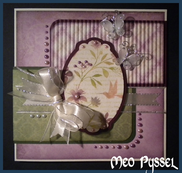
This card is made with one of todays experiments with Hero Arts stamp Flower Bird Garden and the emboss resist technique. The papers that is used is from Maja Design’s collection ”Ska vi ta en fika?” (translates to ”wanna take a coffe?”).  The bow is tide with my homemade Bow Easy (there is a post with a template for those who are interested) and the butterflies are stocking butterflies bought at a fabric shop. The image is cut with nestabilities Labels 10 and the frame is created by me tracing around the die i cut with to make a smaller frame then taking the next sized die. The top horisontal paper is run through a currugator. All the papers have been distressed with either Dusty Concord or Peeled Paint.

The image is made by stamping the Hero Arts stamp Happy definitions with Shabby Shutters on a piece of paper and then clear-emboss Hero Arts stamp Flower Bird Garden onto the paper (make sure the letters are dry when in my case the distress ink stays wet for a while and therefore might take on embossing-powder on places were it wasn’t intended). Then I spongened (and something by take the foam-piece of the blending-tool) colored in the open spaces with Shabby Shutters, Peeled Paint, Faded Jeans, Dusty Concord, Worn Lipstick and Tattered Rose.

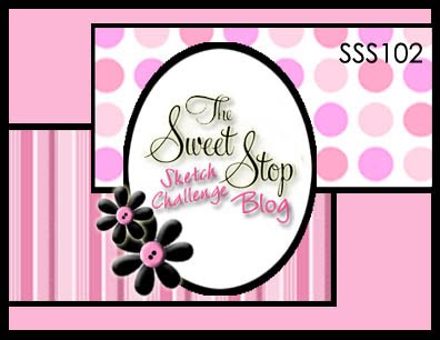
I’m entering this card for two challenges also, the first is Lily of the Valley Challenges (#90) and the second is The Sweet Stop (SSS102). The first one is simple a Spring Challenge and the second is a sketch.

———————————————————-

Idag har jag gjort ett kort med en av de bitarna som jag lekte med tidigare idag med stämpeln Flower Bird Garden från Hero Arts. Alla papper på kortet är från Maja Designs kollektion Ska vi ta en fika?. Den översta horistontella biten är körd genom min papper korrugator och alla använda papper är distressade med antingen Peeled Paint eller Dusty Concord. Rosetten är knuten med hjälp av min nya fina handgjorda Bow Easy (Det finns ett inlägg med en mall för den som vill göra en egen). Motivet är skapat genom att jag använde nestabilities Labels 10 och stansade ut formen och sedan ritade runt dien så att jag kunde klippa ut en som passade som ram runt, på det sättet får jag en ram som passar runt motivet och jag får en som är mindre än nästa storlek på die.

Jag började med att skapa motivet genom att stämpla Hero Arts Happy definitions med Shappby Shutters och sedan embossade Hero Arts Flower Bird Garden med klart embossingpulver på detta. Jag färglade sedan motivet med hjälp en en svamp och distressfärger. Det här motivet är färglagt med Shabby Shutters, Peeled Paint, Faded Jeans, Dusty Concord, Worn Lipstick och Tattered Rose.

Jag är med i två olika utmaningar med det här kortet den första är Lily of the Valley Challenges (#90) och den andra är The Sweet Stop (SSS102). Den första är helt enkelt en utmaning med temat vår och den andra är en layout.

Embossresist with Hero Arts: Flower Bird Garden

I’m playing around with my Hero Arts stamp Flower Bird Garden. I first saw the stamp and this way of handling it on ScrapTime’s podcast episode 602, but you can also see it on Christine’s Blogg here.

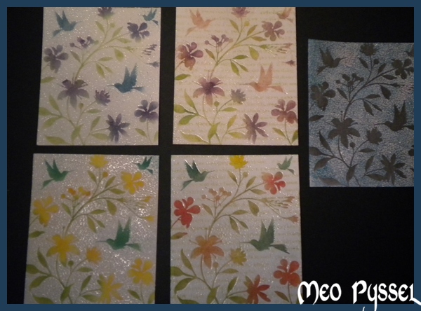
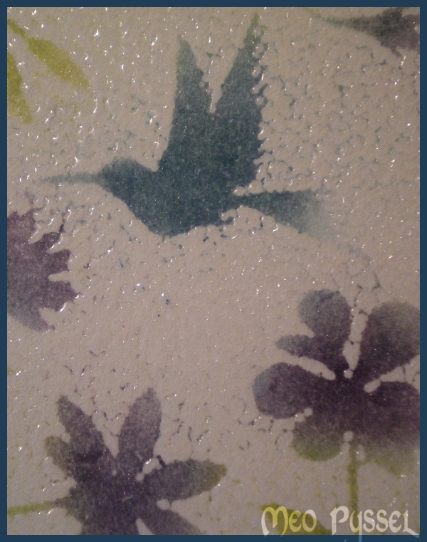
I really like the effekt that she got when she used the letter-background so i made two like that and two with a plain background. All the sample has been colored with distress by using a sponge. I saw that Jennifer McGuire used the same technique but that she filled in some of the spots with white to get rid of the cracks that you can see on my ones. I do like the more rustic appearance i keep the cracks visible.I did take a wet que-tip for the areas that were the cracks were many and that had a lot of color just t tone it down but without removing all the ink (see the picture to the right). In the cases were i used the letter-background i did use Hero Arts stamp Happy definitions. I think that the letter ones has a softness to them that is really appealing.

Colorcombinations:

  • Top-left: Leafs are peeled paint with shabby shutters on top, flowers are faded Jeans with Dusty Concord on top and the hummingbird are Dusty Concord, Pine Needles that have a coat of Faded Jeans on top.
  • Bottom-left: Leafs are shabby shutters and Peeled paint on top. The flowers are Mustard Seed and Spiced Marmelade mix together and the humingbirds are Pine Needles with a bit of peeled Paint to light it up.
  • Top-right: The letters are stamped with Shabby Shutters. The leafs are Shabby Shutters with Peeled Paint on top, the flowers are worn Lipstick with a think coat of Dusty Concord on top and the Worn Lipstick Again, some of the flowers got a touch of faded jeans also. And lastly the hummingbirds are tattered Rose and some of the greens that spilled over when coloring the greenery.
  • Bottom-right: Leafs are Shabby Shutters with Peeled paint on top, the flowers are all diffrent with combinations of Mustard Seed, Worn Lipstick, Spiced Marmelade and Peeled Pant. The hummingbords are Pine Needles with a lot of Peeled Paint as shadowing.
  • The middle right: On this one i first distress the background-paper with Broken China and then clearembossed the image and distressed it with Black Soot.

Mojo Monday 184 – Cup of Tea

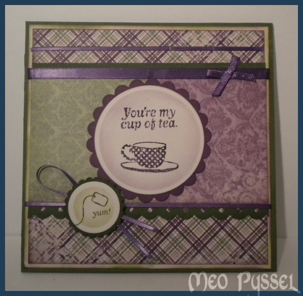
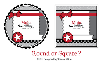
This card is made with this weeks Mojo Monday challenge as inspiration but also thinking of my friend Helena that loves tea. I want to make a card to her as a welcome-home-gift.

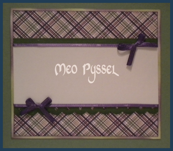
All the papers are from Maja Design’s collection ”Ska vi ta en fika?” (it translates to ”Wanna get a cup a coffe”). All the papers is distressed with Dusty Concord or/and Peeled Paint. The main image and the texts are from basic Greys stampset Cup of tea and the teabag on the sentiment is from a stamp that is a free sample with the paper ”Craft Stamper”. The circles are nestabilities and the scalloped border is Fiskars border punch. All the ribbon is used were a lavender color that i then colored with copic V17. I also made an matching inside with a large area for a message.

Filmstrip: Thank You

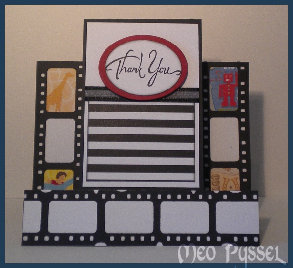
This card is made as a thank-you-card for my friend that help me download new and exciting episode of my favorite series. The Card is a stepcard with a one center front panel. I started out with making a lots of filmstrips with my Tim Holtz Filmstrip Frames and then i picked some papers from DCWV’s All About Boys stack that i used as stills from different films. After putting them together i realised that the colors were very diffrent and that it would be very hard to make a nice colored cardfront to it so i choose to make the rest in black and white with a hint of red to coordinate with the superman cape and the robot.

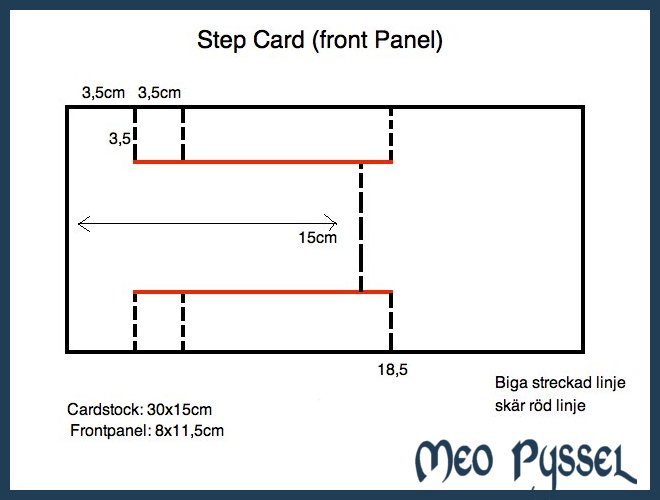
I did google a lot to get the measurements right on the card but i wasn’t happy with any of the descriptions so I made my own. I wanted the folded card to be a 15x15cm card so i fitted the rest to that measurement. You can change all the measurements but the tip is to make the first folds at the sides the same width so that the card can stand steady. Click the image to see a bigger picture or to copy it. Hope you enjoyed this one.

Basic Grey’s Challange 40

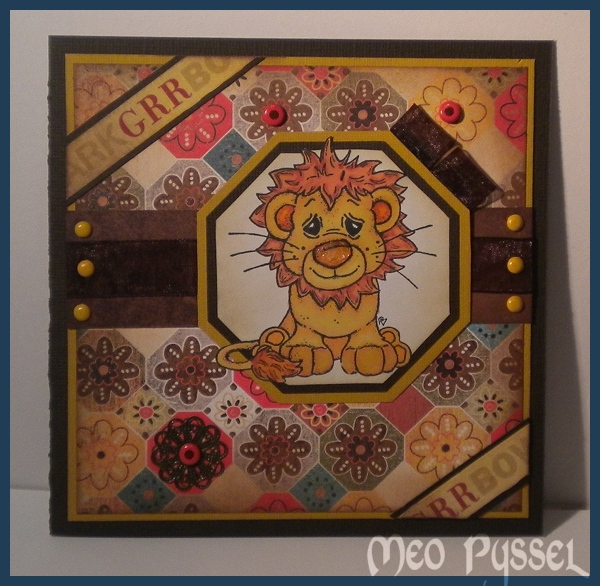
Todays card is made and inspired by the ongoing Basic Grey challenge. The theme of the challenge is recycled so i have recycled the ribbon used (it was from the beginning an embellishment on a skirt) and the pendant in the lower left corner (it’s an brokendown necklace). The Papers that is used are from Basic Greys collection Max and Wiskers. The words in the corners is a ribbon of unknown origin that i have distressed with Spiced Marmelade and then spritzed water on to make a more subtile color. The dots on the card, both yellow and orange, is brads of different brands. The image is Magnolias Lion and he is colored with Promakers (Mustard, Gold, Henna, Terracotta and apricot). The lions nose is coated with crackled accent but since i was a bit impatient i heated it with my heatgun and something happened that made it more like melted plastic then anything else. But my idea with it from the beginning was to create a texture like the nose of a cat and dog (and maybe lion?) i think it worked out OK anyway. The frame behind the lion is made with nestabilities. The inner frame is made by tracing on the inside of a die, the brown one is the same die but run through my cuttlebug and the last and yellow frame is the same die again this time traced round the outside.

I’m more and more often finding myself make a double frame on my card and i think that is a bit of waste of papers so i have started to cut out a square in the middle (in this card of the yellow backgroundpaper) and saving it for a later project. The first time i make this I thought that it might make the card unbalanced due to the layering in the middle of the card. But so far and with the bazilpapers that i most often use that isn’t a problem so i think that is a good tip for anyone that feels the need to save paper.