Kategori: Kort

Konfirmationskort

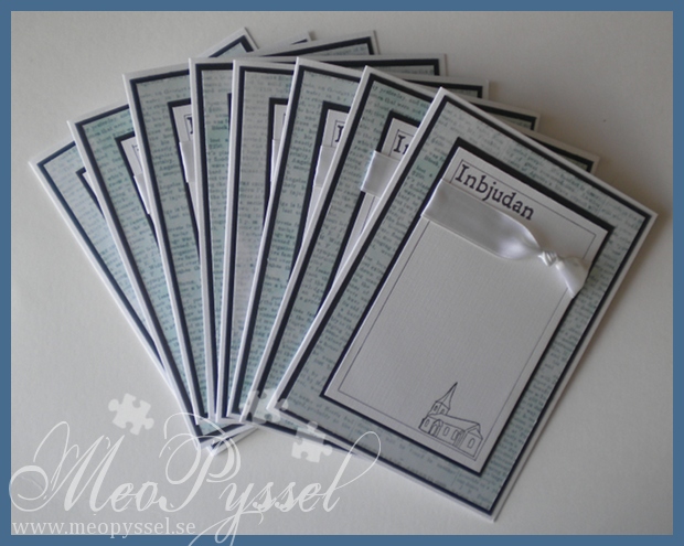
All day yesterday i was a very busy bee creating 8 cards that my aunt have ordered.  I got completely free hand making 8 confirmation invitations. This will be my first payed order so I’m a bit happy for that! I did wedding-inventions for my friend that got married last summer but them i made for free after she bought all the materials i needed.

I went with a clean and simple design sense i had to do a few of them. They are 15x11cm and the patterned paper is Inkido’s Turquoise Newspaper. I wanted a hint of blue when my two cousins that will be confirmed is two boys.

When planing the card i realized i had no stamps that would be fit for the occasion so i went downtown and came home with Reprint’s text set and You Do’s Wedding set. The stamps I ended up using is from You Do’s wedding set witch contained but the greeting (invitation in Swedish) and the small church.

The inside is simple decorated with a big black block that the information will be glued to when my aunt gets the cards and prepare then for the send.

I’m very happy with the simple but still nice look, only bad thing is that I’m now out of both white and black paper but another trip downtown might help that problem.

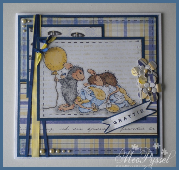
A House Mouse graduation-card

Todays card is a graduation-card, which explains all the yellow and blue (the Swedish flag). It’s made to be sold and don’t have a preconsidered receiver and lacks dates and years because of it.

All the papers are from Maja Design’s summer collection and i did distress the pleaded paper a tiny bit with faded jeans. All the papers have been doodled around and the edges have been painted black. I have done the layout after this weeks Saturday Sketch Challenge (see the picture at the bottom-down to the right).

The image is from my House Mouse Birthday: Balloon set and using the stamp Pop-ular fun. I Have colored my lovely mice with promarker trying to keep a soft color scheme. I did not have a soft blue so i used my midnight blue witch a picked up color from with my blender-pen. As adding a bit texture and depth into the image i stamped Hero Arts background-stamp Happy definitions in Antique Linen.

The flowers are made by Fiskar’s Retro Flower Medium and flower power punches, using the same paper as the rest of the card and a soft yellow pearl as centerpiece. I kept going with the same pearls as embellishments on the outside. The ribbon is regular satin ribbon in two different colors and sizes.

I made the inside using the same background paper and i did the Happy definitions on the Greeting space, light enough tpo give depth and still do’t disturb the message that will be put into it.

Challenges:

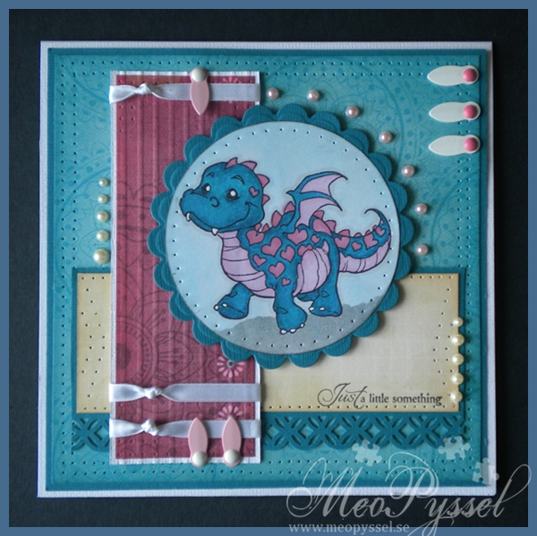
Aqua, Pink and Cream Puff-heart Dragon

Todays card is one inspired by Whiff of Joy’s challenges, that i found a few days ago, and it’s for my dear friend Eva for being my light and inspiration!

Sense i only have one Whiff of Joy stamp that became an easy choise, and it’s not getting harder by the fact that it is one of my favorites. The challenge this week was ”aqua, pink and cream” (#104) so i decided to give it a try (even if i just realized that it’s closed now but im very happy with the card). The image is of course Whiff of Joy’s Puff-heart Dragon and i colored him with both promarkers and copics. I did go over the colored image with my blender to get the more distressed look. The background of it is made with weathered wood and tumbled glas.

The papers are all from Bo Bunny’s collection Sophie, and i just love these papers. All the papers have been inked and distressed with either Broken China, Worn lipstick or Antique Linen. I did paperpierced a lot on this card and all the odd shapes like the circle and the arrow-like one on the cream paper is made with Gina K’s paperpiercing-templates. The sentiment is also from Gina K and is from the Fanciful labels. On the pink paper i also scored at 0,5cm apart to give it more texture. The border at the cream papers

The inside is made by the same papers and are inspired by Donna Wardel’s card-insides. Unfortunately my white ribbons has run out so i used one matching the cardstock instead.

I’m entering this card into A spoon full a sugar nr 158- Things with wings.

Pink Flower Lady

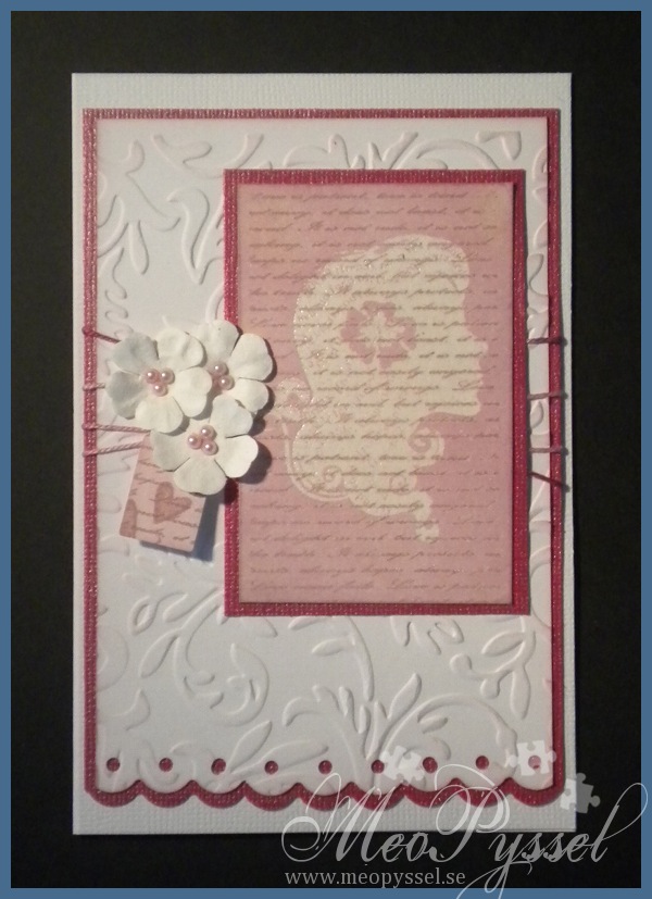
Todays card is made with an focal that I experimented with yesterday using emboss-resist-technique.

The focal image is first stamped with Gina K’s timeless textures, with Versa Colors 152 Ash Rose, the script stamp and then i clear-embossed Hero Arts Flower Lady. After that the entire imaged got heavily distressed with milled lavender. I did the same thing with the label, that is the Quickutz die labels, and i stamped two small hearts on it with the Ash Rose again. The cards background is a simple white cardstock that have been teated with provocrafts embossingfolder Victoria and then lightly distressed with some more milled lavender. The bottom edge, bot white and pink paper, have been punched with Fiskar’s border punch scalloped circles. The flowers are simple white Reprint papers that has been embellished with some small pearls. The ribbon that is used is a pink multi-colored one that i think match both the dark and the light pink. The dark pink cardstock is a bazil bling one which makes it a bit hard to get a accurate picture of the color but it works really good together with the ash rose and milled lavender. The card is a 15 x 10cm, very close to an A6.

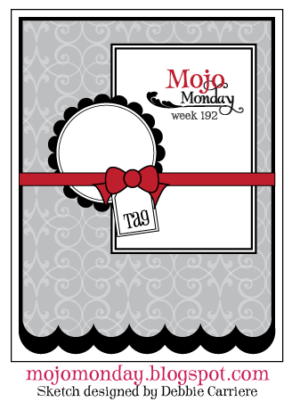
The cards layout is from this weeks Mojo Monday (#192). I didn’t change much but I’m happy. I’m also trying to enter this month Hero Arts challenge for the first time.

Summer Florence

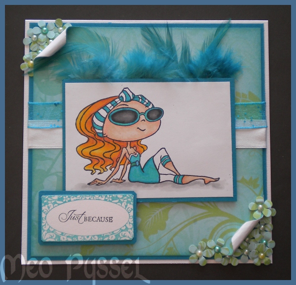
Todays card is one that i made pieces of being a bit sick so excuse the lack of details.

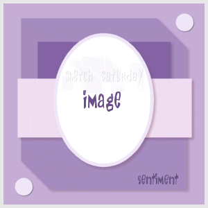
The image is Kraftin’ Kimmie’s Florance and the is colored with Promarkers and Copics. As an afterthought i think that the focal is a bit empty and boring and i wish i would have distressed or drawn a frame for her. The Greeting and it’s frame is both Gina K’s Fanciful tags and the frame was stamped with Versa Colors 20 Turquoise. The flowers coming of the corners is the thing im most satisfied with and they are made with EK Success Flower Power punch. I added a medium peal into every one in a couple of different colors. The background paper is from an very old paper pack that i don’t know the name of brand of.  I used Sketch Saturday for the layout. The top block is made from feathers i found in my stash, i think they are form a jewelry kit from Panduro, but I’m not entirely sure.

Challenged entered:

Caroline on Echo Park

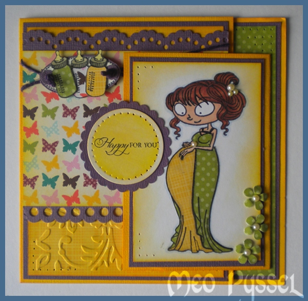
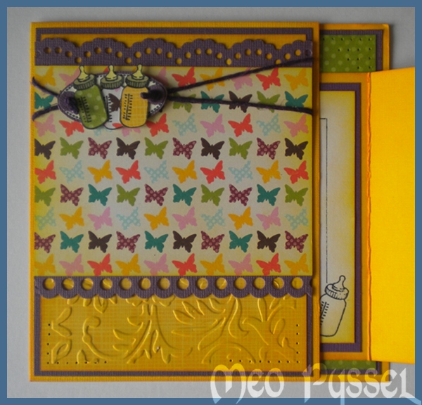
The card has a joy-fold and are for my sister in law which is waiting her second child.

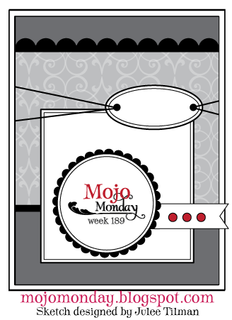
I have been working out from this weeks Mojo Monday’s layout and all patterned papers are from Echo Park’s collection A walk in the Park. The image is Kraftin Kimmie’s Caroline and i have colored her skin with copic and the hair with promarker and the dress have been paper piced with the Echo park-papers, I have done the same with the bottles. The bottles are mounted on an oval from Gina K’s Fanciful Labels and the greeting is from the same set. The borders are from Nellie Snellen and i dry embossed the yellow patterned paper with my Victorian embossingfolder from Provocraft. I have distressed all the papers with Mustard Seed and Spiced Marmelade  (and the green paper is distressed with Peeled Paint. The flowers are Ek Sucsess’s Flower Power and i did embellished them with a small pearl. I kept the pearls going in Caroline’s hair and dress also. The scalloped circle containing the greeting is made with nestabilities and Mavy Uchida scalloped punch.

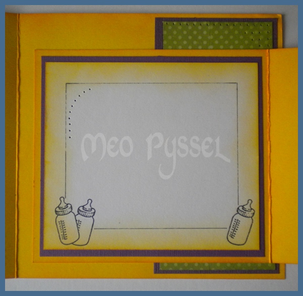
I’m not entirely happy with the inside, as an after thought i think i should have dressed the background in a patterned paper. I was to greedy about the papers when i first thought abut it but i have to admit that it doesn’t look as goos like this.


Challanges I’m entering with this card:

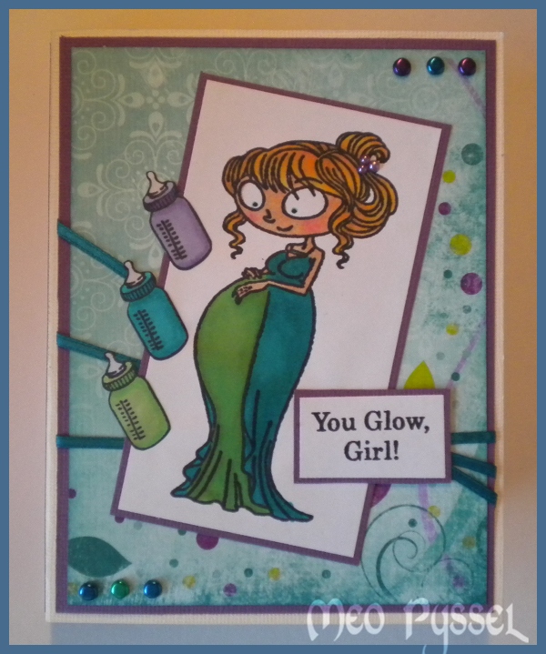
Caroline in a tealight card

Todays card is one inspired by my pregnant friend, she is expecting her second and I’m really excited. This beautiful stamp landed in my mailbox today so I just had to make something with it. The stamp is Kraftin’ Kimmie’s Caroline. I have used both the main image and one of the texts and the bottle. All the images have been colored with a mix of promarkers and Copics (copics are used on the skin and as one of the three petrol-colors). I did also add some small pearls on her hairclip. The embellishments on the outside is metallic brads and a ribbon i found in my stash. All the papers is Bo Bunny’s Peacock Lane. All the papers have been distressed with either Peeled Paint or Broken China.

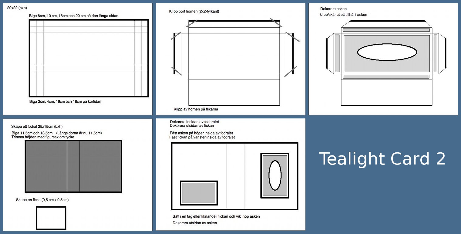
The card is a tealight card, another kind then the one i did the last time. I have made a template but in not happy with it, so i will try to make a better one on a later occasion so bare with me until that. You can find the template at the bottom (click to see it larger). I did another size on my pocket then the template shows because i felt i needed a bigger one. This kind of tealight card I first found the StampARTic site were there also is a very nice tutorial that my template is based on.
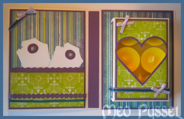
On the inside I used the same papers and ribbon but adding a light purple bow (made with my bow easy). The scalloped edge on the pocket is made with a scalloped scissor. The purple bubbles are a extra from Provocraft’s alphabet Babyface. The heart-window is made with a Nestabilitie, the frame of the heart is made by me tracing around the edge of the die so i just got a bigger thin frame. The tags in the pocket is Magnolia’s Vintage tag the i have distressed with some Broken China.

And by make a mistake i learned something so here is todays tip: Put the panel together first and glue it on the unmounted box, then cut the window and lastly assemble the box. I did the window and the box which made me make the window twice… Another goo thing to remember is that you don’t blue either the top or bottom flap when the box so the receiver can open it.
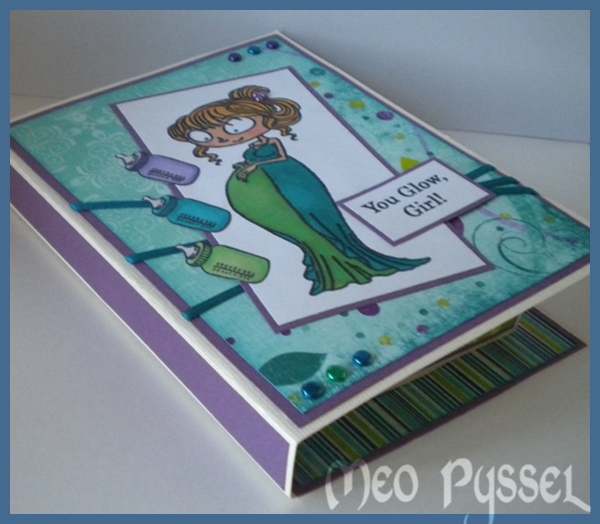
And here is a little picture of the card when closed. Something i don’t like with this kind of tealight card is that the tealightbox is so small that the edges probably will be bent in the mailing-process.

I’m really happy with the colors, but they are very me so it’s not strange. But i had another vision from the start which explains why i have the cream base for my card instead of something maybe petrol or green, but i think it looks good anyway. I’m also entering this card from this weeks Simon Says Challenge that is ”Anything Goes”.
Green Penny Black

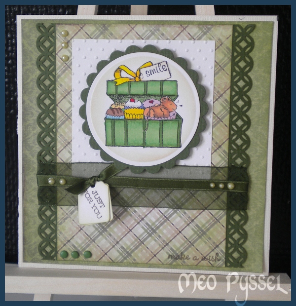
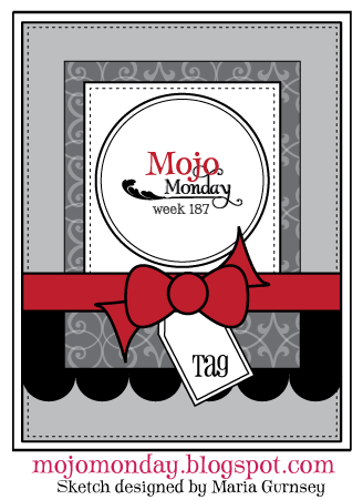
This is the result from yesterdays craft-session with my sister and her friends. The layout is from this weeks Mojo Monday (#187). The image is one from Penny Black’s clearstamp set Piece of my heart, and as usually it’s colored with promarkers. The word ”smile” on the images tag is a part of a sentence from House Mouse’s set Birthday: Ice cream. And the text in the left bottom corner is from Penny Black Critter Party and the ”just for you” on the tags, that is the Quickutz die tags, is from Hero Arts Warm wishes. The border is made with Martha Stewart’s borderpunch Modern Garland. The papers are from Maja designs collection ”Ska vi ta en fika”. The white paper have been dry embossed with provocrafts swiss dots embossingfolder. The other decorations are just light green pearls and dark green brads. Im also entering this card into the Simon says challenge – emboss it again sense in really happy with the card and the I love Promarker (#62) Anything goes.

House Mouse Birthday-Spring-Card

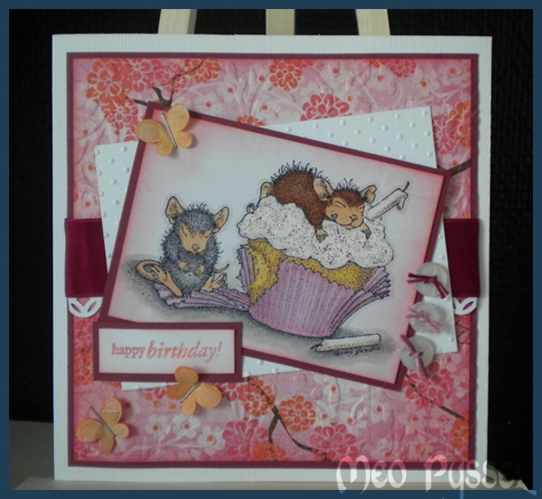
Todays card is a birthday card for my sister that turns 23 in the beginning of next week.. I don’t think this is the colors i associate with her but i stared with a pink cupcake-holder then i just became this pink…

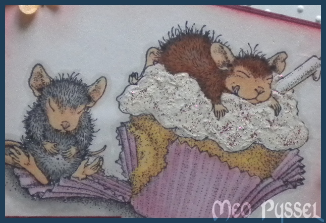
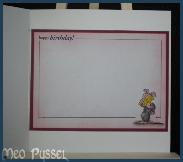
The image is House Mouse Birthday Cupcake that is a part of the Birthday: Ice Cream-set. The little mouse with the cheese-gift, on the inside of the card, is from the same stamp-set. The images is colored with promarkers and i’m really happy with the result on the cupcake (gold, apricot and pastel yellow). On the frosting on the cupcake i have used my snowmarker, very thin layer, and then i painted on some Magenta sticklers. I use a brush to paint the stickles so i could get a thin layer and exactly were I wanted it. You can see the dimension and the frosting better in the picture to the right. The sentiment is a Penny Black stamp from the Critter Party-set. I stamped it with Versa Colors 15 Magenta. 184 Misty Mauve and 13 Orange to match the colors on the paper that is from Crate Papers collection Pink Plum. I have tried to keep the color-scheme on the inside.

All papers and stamped areas have been distressed with Worn Lipstick and the fabric butterflies have also been distressed with Worn Lipstick and some Spiced Marmelade. The butterflies had a to strong colors so i used the backside up to just get a hint of the original color that i then altered with distress inks. I just stapled on the butterflies with a regular staple-machine. The background paper and the white paper have been dry embossed with provocrafts embossingfolders. On the background i used Victorian and on the white paper i used swiss dots. The border under the ribbon is made by Martha Stewart’s border punch modern garland. The buttons is from old clothing and have been embellished with some multicolored pink thread.

The Layout form this card i got from this weeks Sweet Stop Challenge (SSS104). And due to nice circumstances I’m also entering this card for a couple of more challenges.

Challenges:


And THANK YOU Kristina for borrowing me the Easel. I think it works great and made the photographing much easier. Now i need to but my own and paint it!

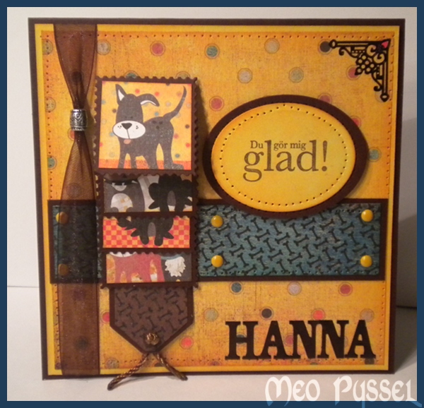
Basic Grey Waterfall card

This card is made for this fortnights Basic Greys challenge ”More the one fold”.

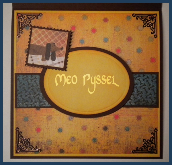
All the papers are Basic Greys Max and Whiskers and the images are cut from a sheet from the same collection. I have for a long time been thinking of making a card with a waterfall feature, but not like the normal ones with the waterfall in the middle and that it. So instead i made it as a side-treatment on a regular square cardbase. I do like the look f it but it’s a bit to much of the main feature right now, i will have to keep experimenting. The frames for the images is a Povocraft die, a free sample I got when o bought my cuttlebug, in shape of a stamp.

The Greeting shape is a nestabilities and the corner treatment and the letters (at the bottom front) is Peel-off and stickers that i have colored with a black permanent marker. Even if the marker is black i have found out that all surfaces that is a bit glossy will turn out dark brown. All light papers have been distressed with Spiced Marmelade and the blue paper with Broken China. The Greeting is stamped with Versa Colors 171 Pine Cone.

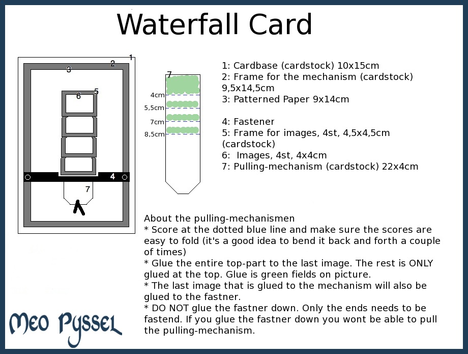
For those that want a waterfall-template i have one (click for a larger image). You can switch all the measurements but keep the pulling-mechanism a bit thinner then the frames. Parts 4-7 is the waterfall-mechanism and can be put on all different kinds of card.