Etikett: Max and Whiskers

Basic Grey Waterfall card

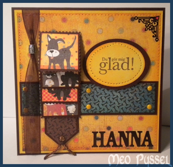
This card is made for this fortnights Basic Greys challenge ”More the one fold”.

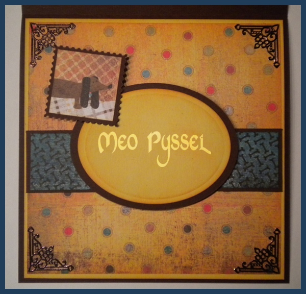
All the papers are Basic Greys Max and Whiskers and the images are cut from a sheet from the same collection. I have for a long time been thinking of making a card with a waterfall feature, but not like the normal ones with the waterfall in the middle and that it. So instead i made it as a side-treatment on a regular square cardbase. I do like the look f it but it’s a bit to much of the main feature right now, i will have to keep experimenting. The frames for the images is a Povocraft die, a free sample I got when o bought my cuttlebug, in shape of a stamp.

The Greeting shape is a nestabilities and the corner treatment and the letters (at the bottom front) is Peel-off and stickers that i have colored with a black permanent marker. Even if the marker is black i have found out that all surfaces that is a bit glossy will turn out dark brown. All light papers have been distressed with Spiced Marmelade and the blue paper with Broken China. The Greeting is stamped with Versa Colors 171 Pine Cone.

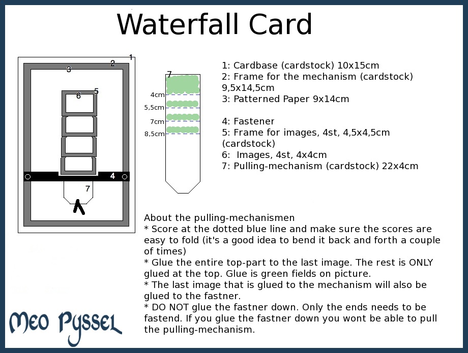
For those that want a waterfall-template i have one (click for a larger image). You can switch all the measurements but keep the pulling-mechanism a bit thinner then the frames. Parts 4-7 is the waterfall-mechanism and can be put on all different kinds of card.
Basic Grey’s Challange 40

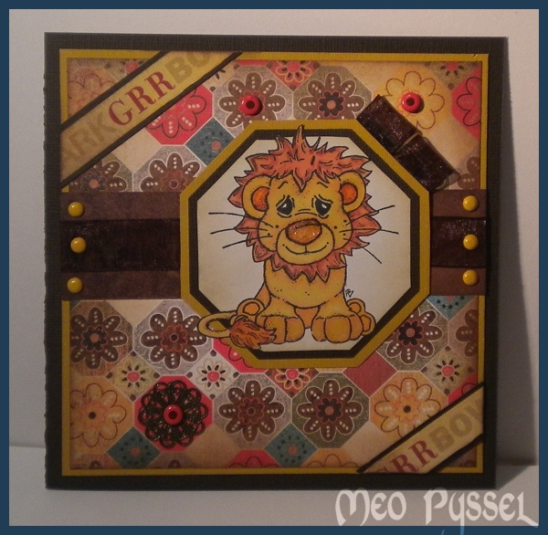
Todays card is made and inspired by the ongoing Basic Grey challenge. The theme of the challenge is recycled so i have recycled the ribbon used (it was from the beginning an embellishment on a skirt) and the pendant in the lower left corner (it’s an brokendown necklace). The Papers that is used are from Basic Greys collection Max and Wiskers. The words in the corners is a ribbon of unknown origin that i have distressed with Spiced Marmelade and then spritzed water on to make a more subtile color. The dots on the card, both yellow and orange, is brads of different brands. The image is Magnolias Lion and he is colored with Promakers (Mustard, Gold, Henna, Terracotta and apricot). The lions nose is coated with crackled accent but since i was a bit impatient i heated it with my heatgun and something happened that made it more like melted plastic then anything else. But my idea with it from the beginning was to create a texture like the nose of a cat and dog (and maybe lion?) i think it worked out OK anyway. The frame behind the lion is made with nestabilities. The inner frame is made by tracing on the inside of a die, the brown one is the same die but run through my cuttlebug and the last and yellow frame is the same die again this time traced round the outside.

I’m more and more often finding myself make a double frame on my card and i think that is a bit of waste of papers so i have started to cut out a square in the middle (in this card of the yellow backgroundpaper) and saving it for a later project. The first time i make this I thought that it might make the card unbalanced due to the layering in the middle of the card. But so far and with the bazilpapers that i most often use that isn’t a problem so i think that is a good tip for anyone that feels the need to save paper.

Max and Whiskers (Hannas födelsedag)

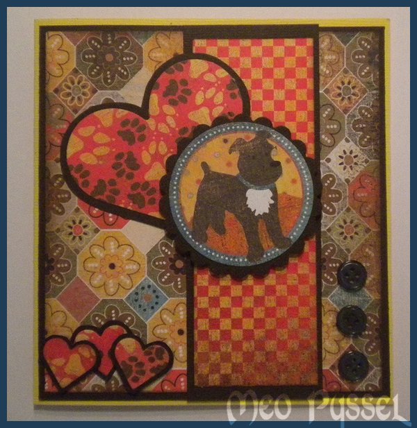
Tidigare i veckan har jag fixat ett kort inspirerat och gjort av Basic Greys pappers kollektion Max and Whiskers. Kortet är till vår vän Hanna som är en stor djurvän och som älskar hundar, därav hundtemat, på hennes födelsedag och det är därför det inte läggs upp förren nu.

Alla papper är distressade med Vintage Photo och både det stora och de små hjärtarna är en nestabilities die. Ramen runt är skapade genom att jag ritade av formen och sen klippte ut. Jag gillar de olika storlekarna och formen på hjärtat men det är synd att de passar så dåligt över varandra. Själva motivet, hunden är utstansat med en cirkel men bilden var en cirkel på ett av Max and Whiskers papprena. Knapparna är från syskrinet och kommer från någon gammal skjorta.

Jag är medveten om att basen till kortet är lite väl gul men jag börjar få slut på cardstock om jag inte skall ha konstiga blå färger (vilket jag av någon anledning alltid köper men aldrig använder). Så här i efterhand inser jag att jag borde ha distressat allt det gula med Vintage Photo för en mer sliten och murrig look, som resten av kortet.

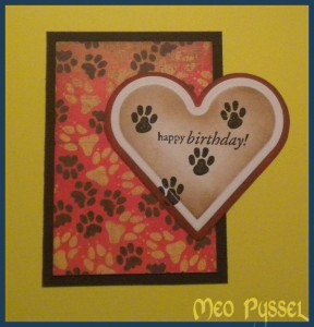
Insidan består av samma papper och ett till nestabilities hjärta som är distressat med Vintage Photo och stämplat med en stämpel från Penny Blacks stämpelset Critter Party. Tass-stämpeln vet jag inte vart den kommer från men jag tror att jag fick den som ett gratisprov på någon mässa efter ett inköp.