Etikett: Vilda Stamps

Thank you-cards

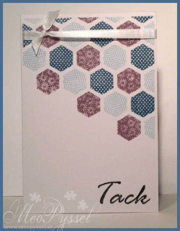
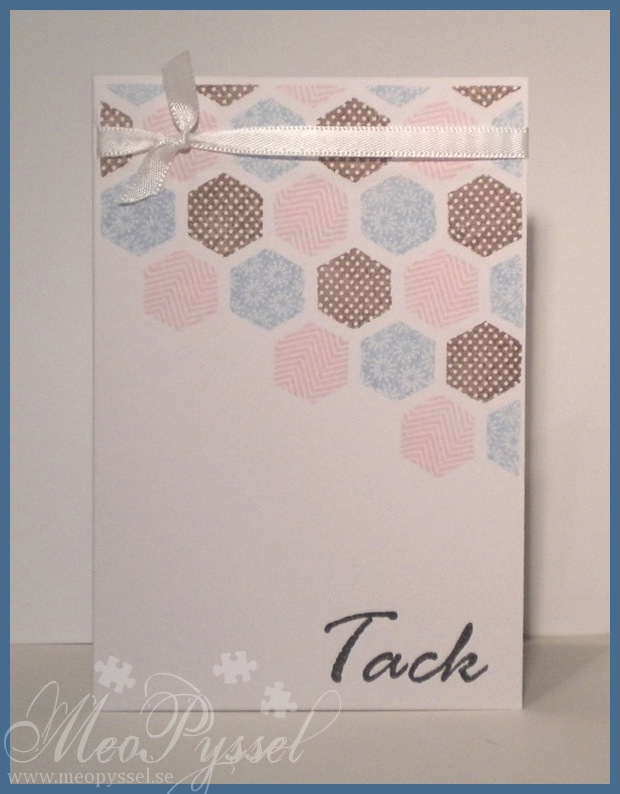
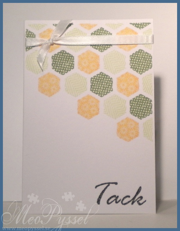
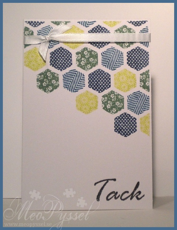
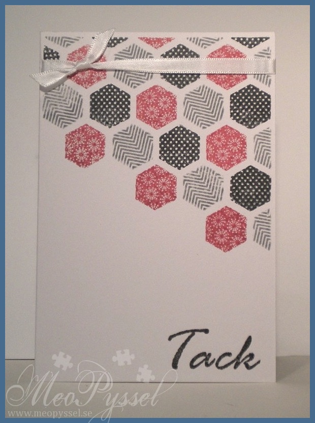
So i have finally finished the thank you-cards for the wedding. They all have the same design but there are 5 main color-schemes, which you see above. I like the two at the top best. The black-red one makes me think of candy somehow and the blue-purple one make me think of blueberries:). My least favorite is the one at the bottom but it was my first and i wanted a more masculine feel so it suits it purpose.

I have used the Papertreyink hexagon die and Happy Hexagons stamp and I just love how they turned out! All the inks are Memento. The sentiment ”Tack” (Thank you) is from Vilda stamps.

Inside is a photo from the wedding and a thank you message.

Stamps: Vilda Stamps – Tack. Papertrey Ink -Happy Hexagons Mini Stampset

Die: Papertrey Ink – Hexagon die

Ink: Memento
Autumn mice

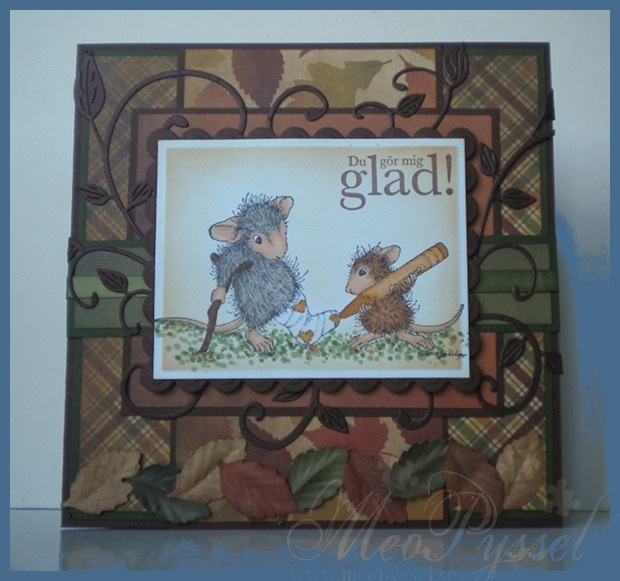
So this week on Sweet Stampin’ our challenge is Autumn Leaves/trees. I decided to make a card for my grandmother that have hurt her leg. Due to the nature of the card i decided to use this adorable image from House Mouse.

I kept the coloring in classic autumn colors and made the ground dotted to give the feeling of falling leaves. The Image have been distressed with Antique Linen and then a bit with Potters clay. I did keep a white border just to make a contrast. The sentiment on the image means ”you make me happy”.

The papers are just fabulous and I found them the other week which just made me so happy, I think I have to go buy some more:) I paired up the papers with a couple of (whole and pieces) of the Cheery Lynn Flourishes. All the papers have been lightly distressed wit memento bamboo leaves just to hide the white edges. The leaves on the bottom is made with papers from the same collection and is punched and embossed with Nellie Snellen’s Floral punch: Leaf ( the green ones are debossed).

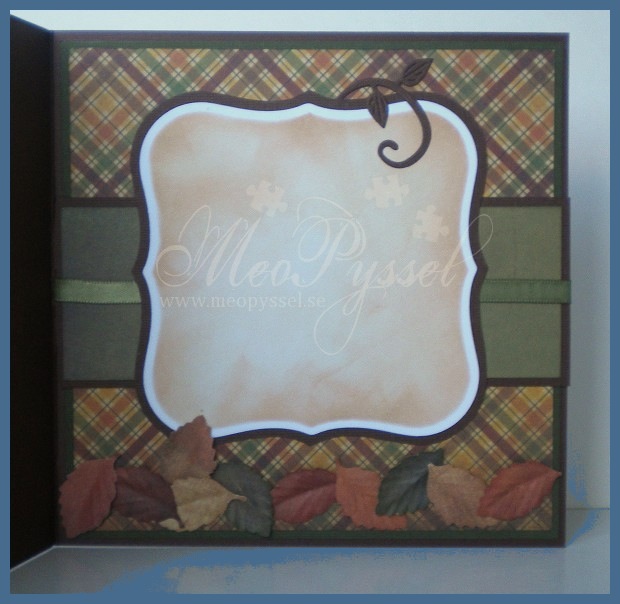
The inside is made to match even if I didn’t embellish as much.

Copic: E13, E11, E21, W1, W3, W5, W7, E39, E35, E33, E31, YR14, YR23, YR21, YR20, E59, E57, YG67, YG63, E07, N3, C0, 0

Stamp: House Mouse – Get well soon – Doctor’s orders. Vilda stamps – Du gör mig glad.

Paper: Reminisce – Autumn Harvest

Dies: Cheery Lynn – Flourish. Spellbinders – Nestabilities – Scalloped Rectangle, Rectangle. Nellie Snellen – Floral Punch – Leaf.

Stamptacular Sunday - Photo Inspiration
Stamptacular Sunday – Photo Inspiration

Ink: Distress Ink – Antique Linen. Memento – potters clay.

A Flirty Nordic Edward

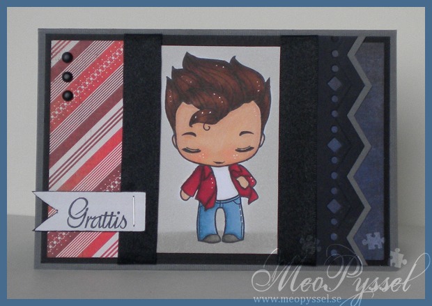
So i decided to get my creative juices flowing so i looked through some of my colored images and looked around the net for some inspiration and i found something good. Tammy made this beutiful edward-card and i really loved how she used the colored rick racs and i wanted to make a similar one. Mine ended up very similar but I’m still happy about it.

I started out with die-cutting my Edward (the one i colored on my copic-coarse) with nestabilities small labels. You can’t really see it on the card because i thought it looked a bit to simple and small so i put the ribbons over the edges instead. My ric rac’s are med with the Classic Ric Rac edgeabilities. The greeting is the Swedish word for ”Congratulations” and are from Vilda Stamps. For the greetings banner i used the Wonky Rectangles Wonky Nestabilities to make the v-cut. Both the background and greeting is colored with Warm Gray copics.

Stamp: The Greeting Farm – Flirty Edward. Vilda Stamps – Grattis

Copic: E51, E21, E11, E93, E49, E29, E37, R59, E46, R29, W1, W3

Paper: Basic Gray – Nordic Holiday

Die: Spellbinder – Edgeabilities – Classic Ric Rac, Spellbinder – Nestabilities – Small Labels and Wonky Rectangles

  • Basic Gray Challenge – #61 Favorite Thing (for my it’s my spellbinders and the three brads that I can’t help to use- but the all time favorite that is used is my cuttlebug!)
  • Simon Says Stamp – Anything Goes

A Blue and Purple Fathom Calmsea

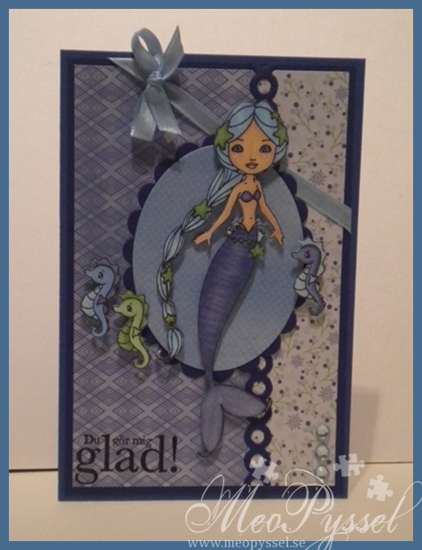
I got a nice tip from Birgitte the other day about an challenge over at the Copic Challenge Group that is about colors of the sea and of coarse got a nice fuzzy feeling and started out another of Sweet November’s mermaids, this time Fathom Calmsea.

Sense the challenge was about colors if the sea i had to keep to the blue theme but i do some more water-like before so i wanted to make this one not so extremely obvious. So i checked through my stash and found DCWV’s Winter Combo stack and wanted to use it. I started out with the light paper and thought it reminded me a bot of seaweeds and corals.

I colored Fathom Calmsea and the three Lios accordingly to the papers. I really like the green touches and I can almost see her peeking up from a puddle of seaweed:) I also tried a new way of coloring the tail. I wanted to get a more fish-like feeling with scales but didn’t want the normal round scale so i tried some horizontal lines. Björn said it look like mackerel so it it worked on him at least.

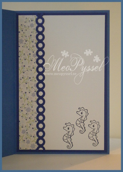
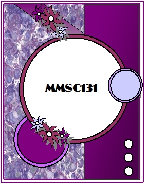
The divider between the two background-papers is made with the Dainty Dots-die from My Favorite Things. For embellishments i used a baby blue satin ribbon and some light blue rhinestones. The card is made from this weeks Midnight Madness Sketch. Instead of the circular parts of the sketch i placed Lio to take up that space. The greeting is ”You make me Happy” in Swedish.

Stamp: CC Designs Sweet November Fathom Calmsea and Lio. Vilda Stämplars ”Du gör mig glad”

Copic: E11, E21, E51, E93, R20, R22, B00, B41, B32, BV02, BV13, BV04, YG17, YG13, 0

Papers: DCWV’s  Winter Combo Stack

Other: My Favorite Things’ Dainty Dots. Spellbinders scalloped and normal oval

Cards of the day 3 – Springflowers

So i found myself with more time so i did yet another card, this time not meant for a kid, but everything works.

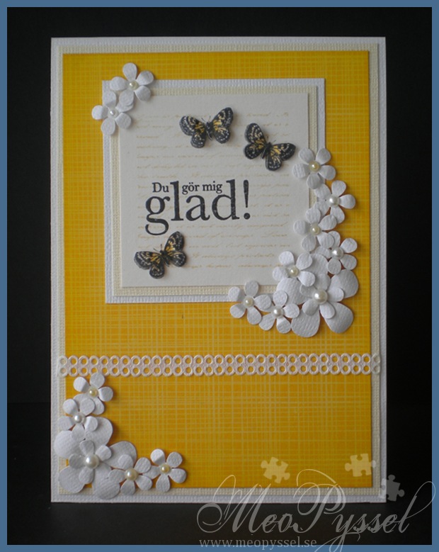
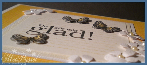
I wanted to try the technique were you stamp the image twice, cut out one and put it over the first for a more dimensional look. The main image here is made by three different stamps (see the details on the first picture to the right). The scripted background is from Gina K.’s Timeless textures, the sentiment is from Vilda Stamps and the butterfly that is Inkido’s small summer butterfly. The Script has been stamped with Antique Linen distress ink and the butterflies with memento black. The butterfly on the paper was first stamped on another paper so i got a lighter colors as ”shadow”, but the cutout one is stamped as normal. The butterflies have then been colored with Promarkers Gold and Pastel yellow, then blended out to the edges. The butterflies have been put to the paper with half a glue dot, but i think i have to come up with a new way when it was very hard on such a small contact-surface, on the body of the butterflies and the wings have been bent up a bit.

The paper is from Echo Park’s 6×6″ paperpack A Walk in the Park and the lace is a self-adhesive paperlace from Panduro. The Flowers are made by EK Success punches flower power and retro flower medium. In the center of every flower there is a pearl, both white and soft yellow. (realized half way through that I’m out of white ones).

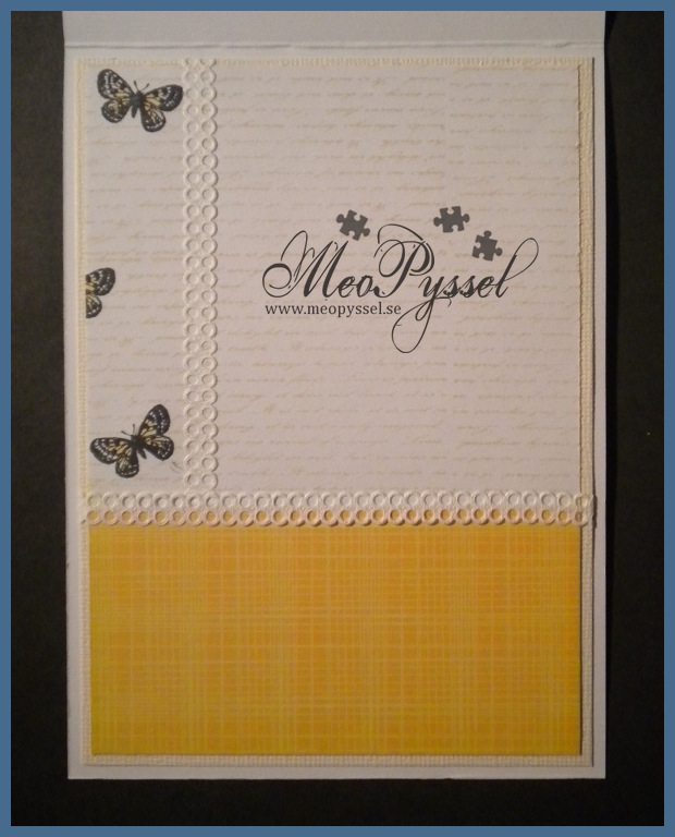
I tried to keep the inside on the same theme by using the same papers and stamps, the greeting is the only one that ain’t there. On the inside I only stamped the butterflies once, on the paper. I stamped the scripted background here also when i think that i just gove a softer look and won’t disturb the writing the gifter will put in.

I got inspired but this weeks Mix it up Monday challenge from Gina K: Wear your white.