Etikett: Provocraft

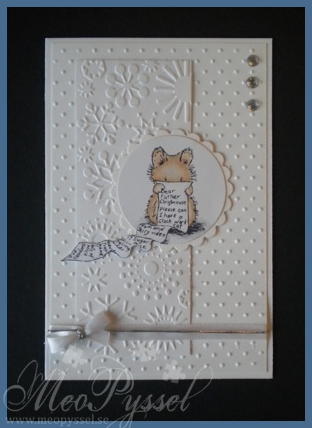
All white Penny Black: Mouse with wishlist

So i just did my first Penny Black card for the order. I have for a long time now wanted to try to make a all white card and when Penny Black’s Saturday Challenge had an challenge of a white and silver card i just jumped on the challenge.

I did use two embossingfolders from provocraft, the Snowflakes one and the Swiss dots.  The image is on of the ones (and one of my favorites) from Penny Black’s Christmas Critters set.

The card is decorated with a white ribbon and some silver thread. I also used some rhinestones that gets a bit of silvery shine against the white aof the card.

Copic: E93, E31, E51, E40, N3, N1, C0, 0

Dies: Spellbinder’s Large and Small Circles and Large Scalloped Circles

Embossingfolders: Provocraft’s Swiss dots and Snowflakes

Stamp: Penny Black’s Christmas Critters

Penny Black’s Saturday Challenge – #176 Christmas & Snowflakes/Snow & Silver

My Wedding-invitations

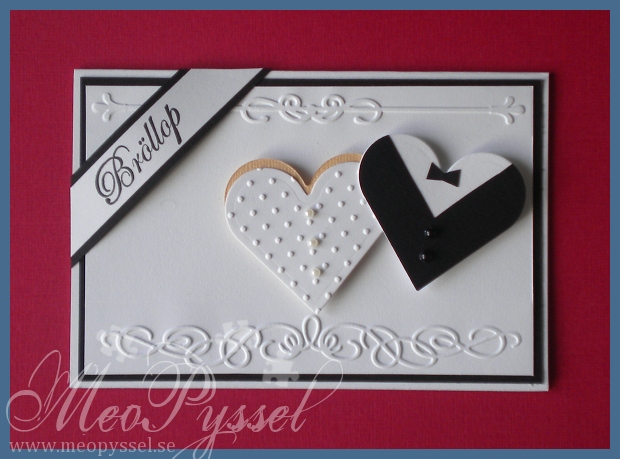
So i have finally finished wedding-invitations. I did finish them last weekend but it took me a while to package them and then get a photo.

The basic feeling, and layout is taken from Dawn from Stampin’ Up that made a very similar card. I kept the parts i could and changed some. You can see Dawn’s card here.

The embossed parts is from from two different small embossingfolders from Provocraft. The top one is from the Iron Works set and the bottom one is from the Organic flourish set. I also used the provocrafts Swiss dot embossingfolder for the ”weddingdress”.

The weddingdress is made by a skintoned heart and a white, embossed oneand finaly it’s decorated with three pearls, small or medium in white or pale blue. The jacket is made by a white heart and then a back on top, and the black ons has a triangle cut out from the top to make the jacket-shape. Finally it was decorated with 2 small or medium pearls and a small bowtie. On the picture you see a card with the small pearls.

The stamp is from You Do’s wedding set and it says ”wedding” in swedish

Dies and folders: Spellbinder’s Heart nestabilities, Provocraft’s Swiss dots, Iron Works and Organic Flourishes

Stamp: You Do’s Bröllop (Wedding)

Juggling Raspberries – Finished Card

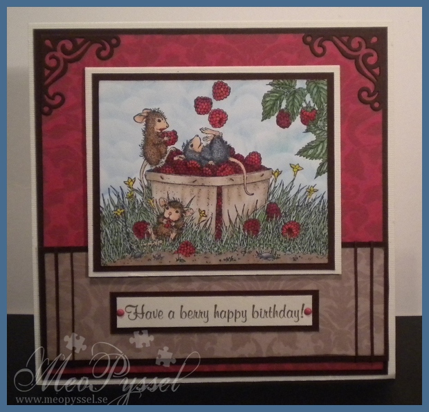
So today i did use my ”Juggling with Raspberries to make a card.

I have been watching the progress of this two-week challenge from House Mouse and Friends and i havn’t come up with a contribution until now.

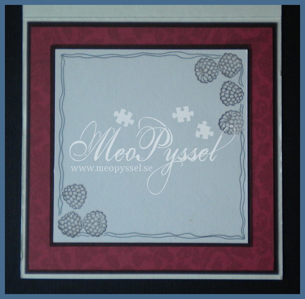
The card is featuring the House Mouse stamp Juggling with raspberries from the Summer: Waterlily-set, the same goes for the raspberries on the inside and on the recipe. The image is colored with copics and distress inks. The sentiment is from the House Mouse set Autum: Berry and is stamped with Versa Colors Pine Cone. The Papers that I used are from Inkido.

The embellishments are brads and small strips of the brown cardstock i used, and the corners are from one of the dies in Provocraft’s set Vintage.

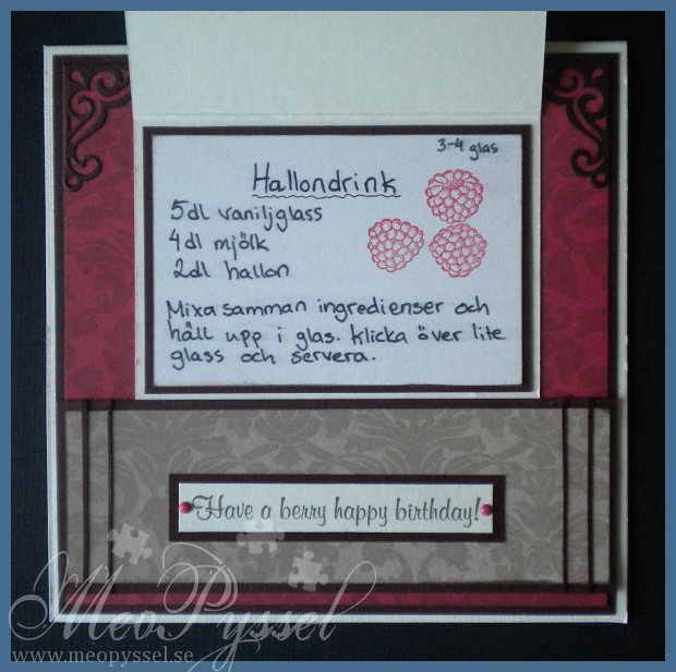
The recipe on the fold is one for a ice cream-raspberry drink. Unfortunately i don’t have a printer for the moment so it’s my bad handwriting on display. The raspberries in the recipe is stamped with Versa colors Cardinal.

Papers: Inkido’s Martha – Croissant, Tuva- Lipstick red.

Stamps: House Mouse’s Summer Waterlily, Autumn: Berry

Copic: E40, E41, E43, R24, R29, R39, R59, G12, GG14, YG17, G12, G14, YG17, YG67, C8, C6, C4, C2, E37, E35, E33, E31, E33, E21, N1, N3, Y17, E00, E13, E11, E21, E04, Blender Pen

Inks: Broken China and Tumbled glass distress inks, Versa Color’s 171 Pine Cone and 25 Cardinal.

Other: Provocraft’s Vintage

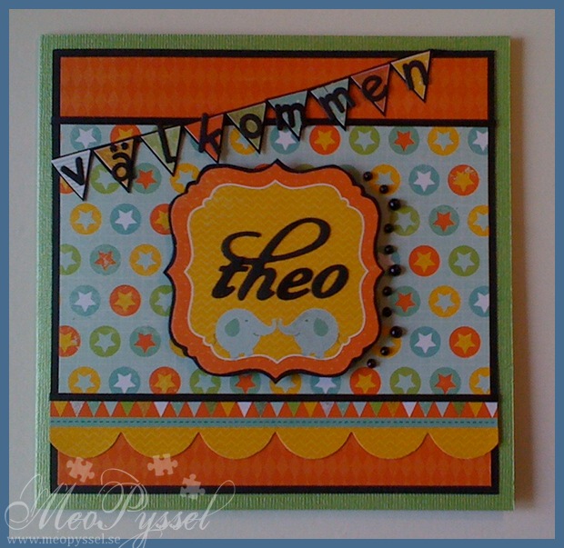
Welcome to the world Theodor

This card is a celebration for my best friends new baby boy Theodor. He was born on the 12th of august and i can’t wait to see him!

Earlier in the week is was by CiLi in Papers and bought some of the new Bo Bunny paper packs and my eyes fell on the Kaiser Kraft’s Party Animals paper pack and i couldn’t leave without it. I fell in love with the colors and that you can make any kids card with it without a problem. I have been thinking of making a card for little Theo for a while so i deiced that the Party Animal paper were perfect for it.

I used this weeks Simon Says Stamp challenge for the layout.

I used some regular black adhesive pearls for the embellishments on the right side of the focal and some glitter pen on some on the banners, one of the elephants and some of the small banners on the border. The banner with holds the sentiment ”välkommen” (welcome in Swedish) is made by cutting out some small banners on a banner-paper in the collection and then gluing it on a black mat and adding the letters. The letters used in the banner is from Provocraft’s Baby face alphabet and the letters on the focal is from Quickutz’s Harvest alphabet. The backing on the ”Theo” is from the die-cut-sheet and it’s backed on black as well.

There is only a photo of the front today when my camera have gone into hiding and i can’t find it anywhere so this picture is taking with my phone.

papers: Kaiser Kraft’s Party Animals

dies: Provocraft’s Baby face alphabet and Quickutz harvest alphabet

I got my Mojo back

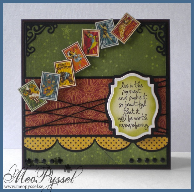
I think i have my mojo back! For the last couple of days i think that everything i do gets OK or worse but today I’m so happy with my card! I really think it’s a success and i really think it’s well balanced! I got my Mojo back, and with a MOJO sketch- how fun isn’t that? 🙂

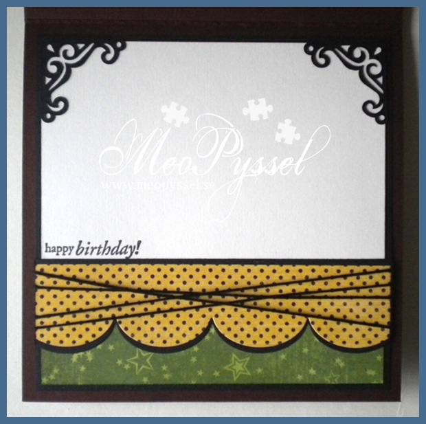
This card is for my dear brother. His birthday was for a few month ago but we haven’t seen each other so i haven’t hurried with the card until now (we will meet this weekend). So a bit late, maybe, bu Happy brithday Oskar!

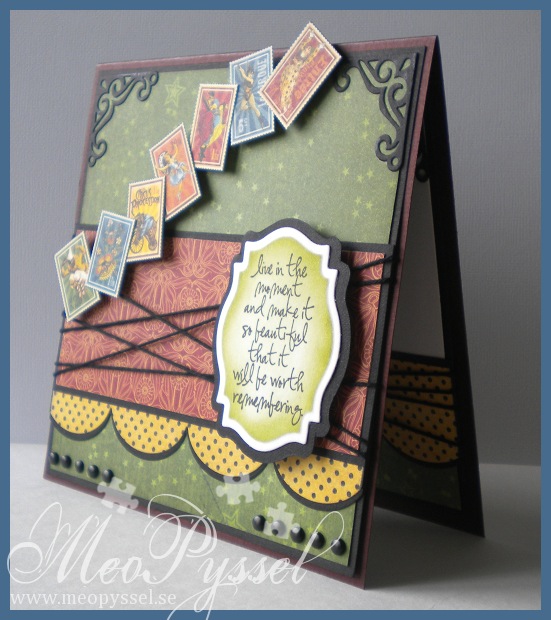
I did choose the colors by that fact that my dear brother told me he liked dark red and green and gray colors with a bit of old texture. I didn’t fin and burgundy or grays but i really like this green paper from Grapic45’s collection Le Cirque so i kept going from that one. All the papers i used if from the same collection. The stamps or circus-pictures that i used across the card is also from the same collection and i simple cut them out and put them up on foamdots.

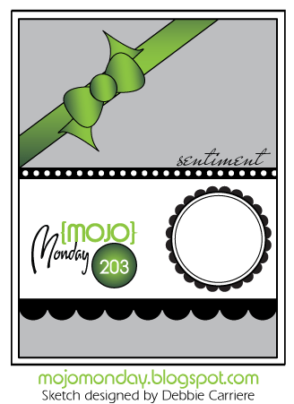
I did use this weeks MOJO Monday sketch for my layout. The focal-point is a Tim Holtz sentiment from the set Urban Chic. I actually started out with the sentiment, that i really is suitable for my brother when he really is out there living his life. I was after i had the sentiment i wanted the circus-stamps. I think it work very well together and i hope my brother will understand the connection and that I’m just amazed over his lifestyle. Anyway… i did frame the sentiment with my new favorite Nestabilitie, the label 18. I cut it out with one of the smaller dies and the traced around the outside of the die on a black paper to get a smaller frame to back it to then i would have got if I used the bigger die for the frame. That is one thing i dislike with the labels, that it’s a big difference between the dies but as long it can be traced around I’m not gonna be to noisy about it.

The green paper and the sentiment have been distressed with Peeled Paint and all the other papers have been with distressed with Antique Linen. The scalloped border is made by my new (and i think it will be an favorite) MFT’s Jumbo scalloped border. I did cut it twice, once in the dotted paper and once in the black so i could the a nice definition against the other papers. The other embellishments are the already mentioned stamps and some regular black brads and some black twine. I did embellish the corners with one of the corner-dies in the vintage die-set.  I so love the contrasts in the card, brought fourth by the black details.

I tried to keep the same layout for the bottom of the inside with a feel smal changes, of course, to give space for the written greeting. The stamp that is used is from Penny Black’s clearstamp-set Critter Party.

Papers: Grapic 45’s collection Le Cirque

Stamp: Tim Holtz’s Urban Chic, Penny Black’s Critter Party

Dies: Spellbinder’s Label 18, MFT’s jumbo scallop border

Other: Peeled Paint and Antique Linen Distress Inks.

Mojo Monday – layout

A Spoon Full of Sugar – #162 Happy Birthday

Goodies from USA

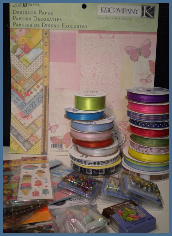
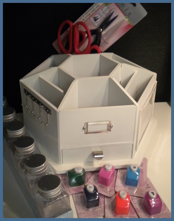
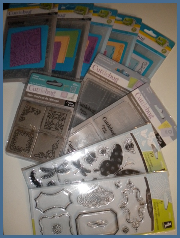
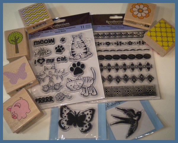
Som tidigare sagt så skulle min kära mor och far till USA och det var därför jag beställde mina Copic-pennor. Jag gav även mamma en lite lista med saker som jag skulle vilja ha i fall att hon skulle se nåt när hon var ute. Det visade sig att hon åkte till Michaels och några andra ställen och hittade en hel del. Hon hittade bland annat en kopia på Making Memories Desktop Carousel, tim holtz shears, en massa stämplar och en massa embossingfolders! Titta bara på skatten hon kom hem med! Hon bar ut en stor påse, som hon knappt kunde ha i famnen, som hon plockad upp en massa godsaker över. Nu ska jag bara sortera in dem och leka lite med dom!

As said before my mother and father went to USA so i ordered my set of Copics. But i also gave my dear mother a list of things i would like if she could find them. She did find some and bought alot other too, and i mean a lot! SHa carried in a big bag from wich she started to show me what she found. Here comes some photos of the treasure.

Masuline Train

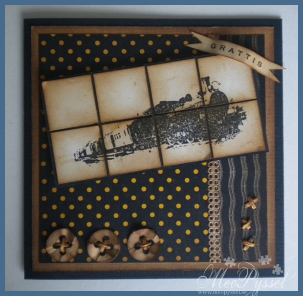
Here comes another card for the men in our life, a dad.

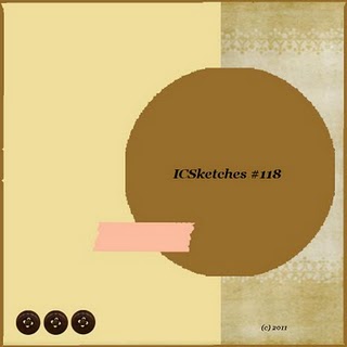
The papers that is used is from Graphic45’s 8×8″ paperpack from the collection Le Cirque. Everything have been distressed with Vintage Photo. The Layout is this weeks Inspirational Card Sketches.

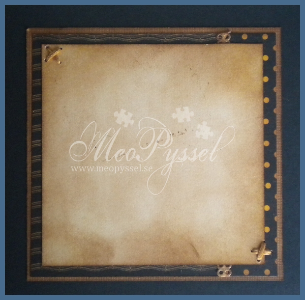
The image is Tina Design the train from the store Arkivet, here in town. The buttons at the bottom is from Provocraft’s Babyface Alphabet dies. The divider between the two patterned papers is a selfadhesive paper-lace from Panduro, also treated with Vintage Photo. I kept goinhg with the stitching from the buttons (embroidery-thread treated with Vintage Photo) on the other side if the card and on the inside.

Challenges entered:

Maskunline birthday card – MC

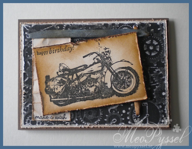
This card is for my Cousin that turn 18 this Wednsday.

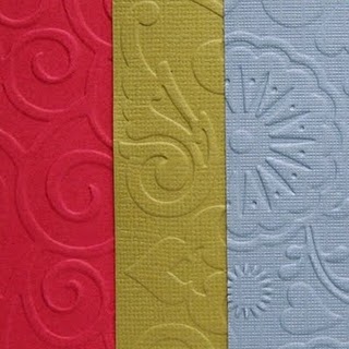
The papers are cardstock and the black one is a Cor’dinations that i have dry-embossed with Provocraft’s embossingfolder Clockworks and then i sanded it to make the white core appear better. All edges have been thorn and distressed with Vintage Photo. The the light block with the sentiment has been wrinkled and distressed with Vintage Photo.

The image is from Tina design found at the store Arkivet. I bought this one and a steam-engine train this Wednesday on Arkivet’s 7th birthday and i love them, it’s gonna be much easier to make masculine cards. The senitiments are from Penny Black set Critter Party.

The ribbons is put through a couple of eyelets (white ones) that i have sanded a bit and lightly colored with black stazon. The ribbons have been colored with distress-inks. The brown one is only Vintage Photo and the other one is a mix of Black Soot and Weathered Wood. I first mixed some water and ink and make some spots on the cotton ribbon and then i used my blending tool to color in the rest, then they were the dried with my heatgun.

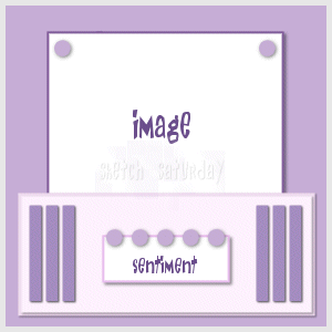
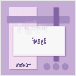
The layout is by this weeks Sketch Saturday (the first picture to the right) and the Technique is from The Shabby Tearoom and is about dry embossing (the second picture to the right).

Challenges:

Pink Flower Lady

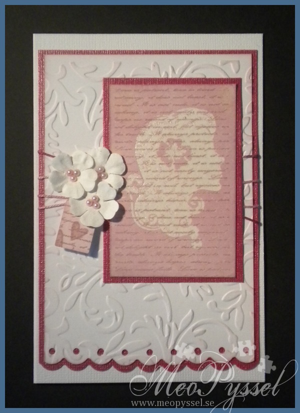
Todays card is made with an focal that I experimented with yesterday using emboss-resist-technique.

The focal image is first stamped with Gina K’s timeless textures, with Versa Colors 152 Ash Rose, the script stamp and then i clear-embossed Hero Arts Flower Lady. After that the entire imaged got heavily distressed with milled lavender. I did the same thing with the label, that is the Quickutz die labels, and i stamped two small hearts on it with the Ash Rose again. The cards background is a simple white cardstock that have been teated with provocrafts embossingfolder Victoria and then lightly distressed with some more milled lavender. The bottom edge, bot white and pink paper, have been punched with Fiskar’s border punch scalloped circles. The flowers are simple white Reprint papers that has been embellished with some small pearls. The ribbon that is used is a pink multi-colored one that i think match both the dark and the light pink. The dark pink cardstock is a bazil bling one which makes it a bit hard to get a accurate picture of the color but it works really good together with the ash rose and milled lavender. The card is a 15 x 10cm, very close to an A6.

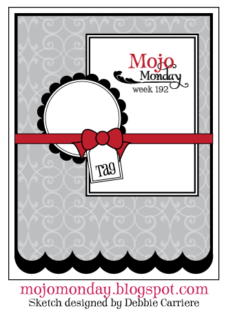
The cards layout is from this weeks Mojo Monday (#192). I didn’t change much but I’m happy. I’m also trying to enter this month Hero Arts challenge for the first time.

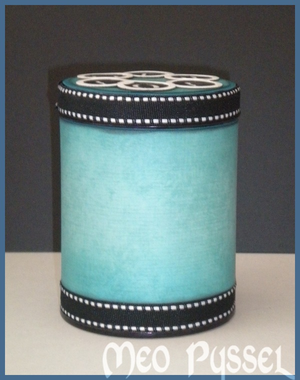
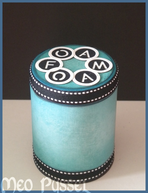
Altered candy-jar for distress foams

Today i finally finished altering my new storage for distress-ink foams. I have been doing it for a while but my paper ran out so i had to wait for new supplies. The blue/green paper is from Bo Bunny’s Peacock Lane and the circles and the alphabet is Provocraft’s alphabet Babyface. The Outline-circle is from the button-die. I tried a couple of ways for the the jar’s body but i thought it my alternatives got a bit cluttered so i kept it clean.

The original jar is a butterscotch-candy-jar from Harrods, London. I do like the jar for it’s size but the Harrods-brand is a bit bulky and made it a bit hard to keep the paper even and smooth on the jar.